Why does the Baskin-Robbins logo hide a 31? 10 symbols, decoded
Published on May 3, 2026
Visual symbols are making a comeback. Audiences are getting better at decoding icons, which raises the bar for logos. When companies sit down to craft a good one, they must make sure it’s memorable, iconic, and simple enough for a child to draw. Of course, the best logos will also contain information about the spirit of the brands they stand for. Let’s take a look at the meanings behind some of the most interesting brand emblems.
Starbucks
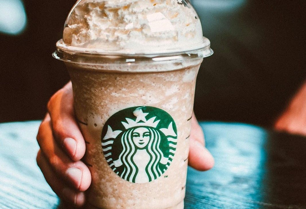
Sirens are a symbol of allure. It’s fitting that they should be the iconic crest of one of the most famous coffee brands in the world. Designer Terry Heckler chose to refer to the exotic origins of "Coffee-Tea-Spices" and its seafaring traders through this image, inspired by a 16th-century maritime Norse woodcut. This was also to match the spirit of the original name: "Starbuck", a character in Melville’s famous Moby Dick.
The logo of the two-tailed siren has evolved since the brand’s creation in 1971. You’ll notice that the official version until 2011 used to have the Starbucks text wrapped around it. The need for text became less relevant with the international success and fame of the brand. Now, the smiling siren alone is enough to represent Starbucks.
Mercedes-Benz
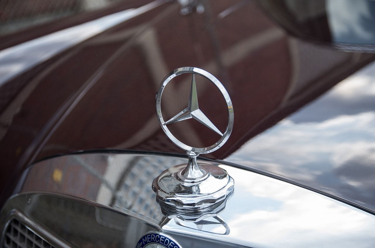
Land, sea, and air: Those were the three terrains Mercedes-Benz hoped to dominate. The three-pointed star that is the emblem of all its vehicles symbolizes the company’s prowess at building motors for transportation in the three fields.
The logo was designed by Paul and Adolf Daimler, the sons of Mercedes’ co-founder, Gottlieb Daimler. They based the idea on a star their father had once drawn on an old postcard, marking their home: to them, this stood as an inside wink to their family. For a few years, the logo incorporated a laurel ring around the star representing victory. This was eventually replaced by a simple circle, which led to the enclosed three-pointed star we know today.
Toblerone
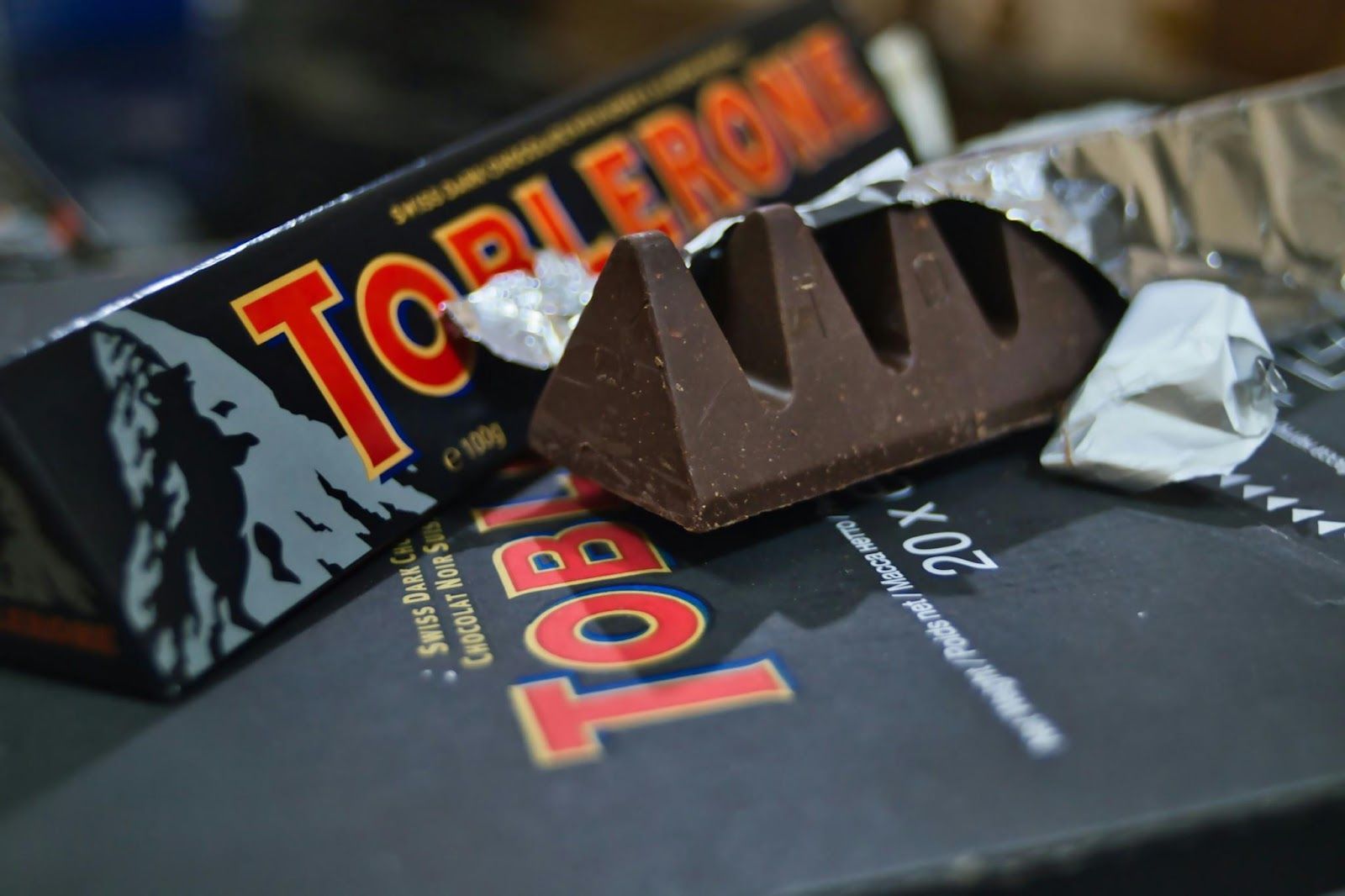
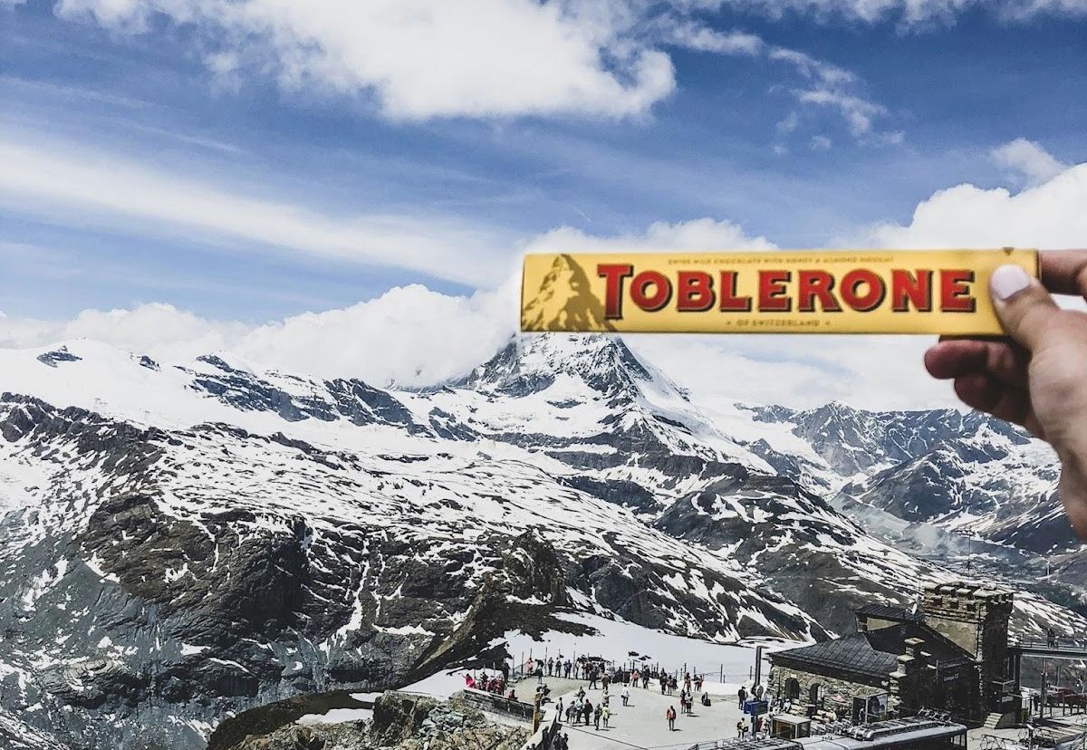
Can you see the bear? In case you never noticed, there’s one hidden in the shading of the mountain. When Toblerone was introduced in 1908, co-creator Theodor Tobler stated that the Swiss Alps had inspired him to give the chocolate bars their iconic triangular motif. The bear was incorporated in honor of the heraldic emblem of Bern, where the chocolate was produced. Its figure is hidden in the design, which allegedly represents the iconic Matterhorn mountain.
Unfortunately, in 2023, the brand announced its need to modify its legendary logo. Switzerland no longer allowed the inclusion of national symbols in the brand when the company relocated its production to Slovakia.
TikTok
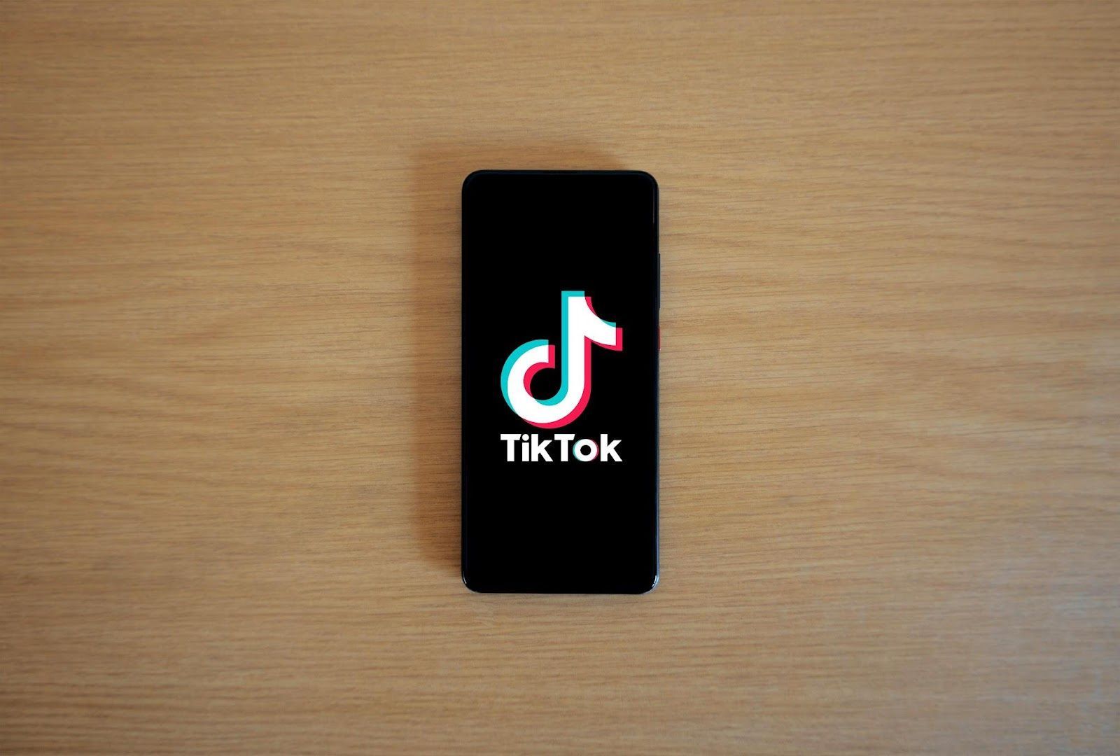
Have you ever been intrigued by the logo of one of the most famous media brands in the world? Why does it look like a buzzing neon sign?
Since its inception, TikTok has sought to inspire creativity and connection in its users. Because it was, at its core, a music-based platform where people would dance, move, or sing, the logo was purposely designed to evoke the feel of music, rhythm, and movement. Hence, the "T" shaped like a musical eighth note and the vibrant lines on its sides. These were added to recall the sensation of joy and dynamism of live concerts and to emphasize the concept of TikTok as a "stage."
Lacoste
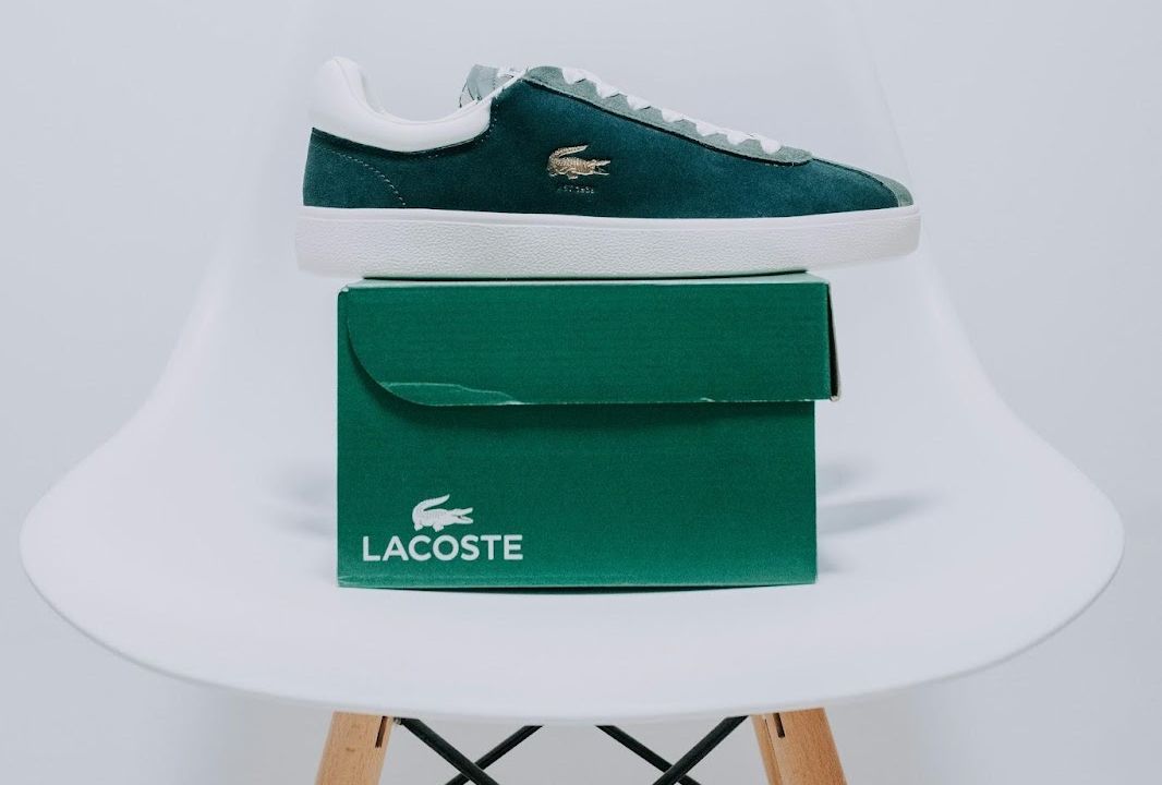
The French luxury sports fashion brand is easy to spot. The green crocodile always stands out in their famous plain tennis shirts.
But why a crocodile? The symbol is straightforward. Creator René Lacoste was a famous French tennis player. One time, before a match, the athlete bet his team captain a crocodile-skin suitcase that he would win. After this, the American press jokingly nicknamed him "The Crocodile." French fans continued to call him that, admiring his attitude on the tennis court. Eventually, Lacoste designed and wore the iconic tennis shirt with an embroidered crocodile, which he later sold as a product, giving birth to the company.
Baskin-Robbins
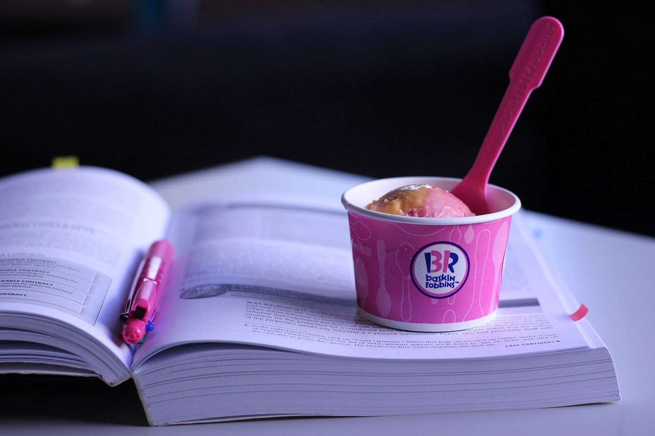
The pink-and-brown logo of Baskin-Robbins might remind you of strawberries and chocolate, but more flavors are hidden in it. 31, to be precise. The pink digits in the "B-R" are there to remind you of the 31 different ice creams the company had to offer when it was born, back in 1945. 31 was the resulting number after brothers-in-law Burt Baskin and Irv Robbins merged their respective ice cream parlors.
Still, since its creation, the company has gone from having one flavor for each day of the month to developing an array of over 1,400. That’s around one flavor for each day for three years and seven months.
NBC
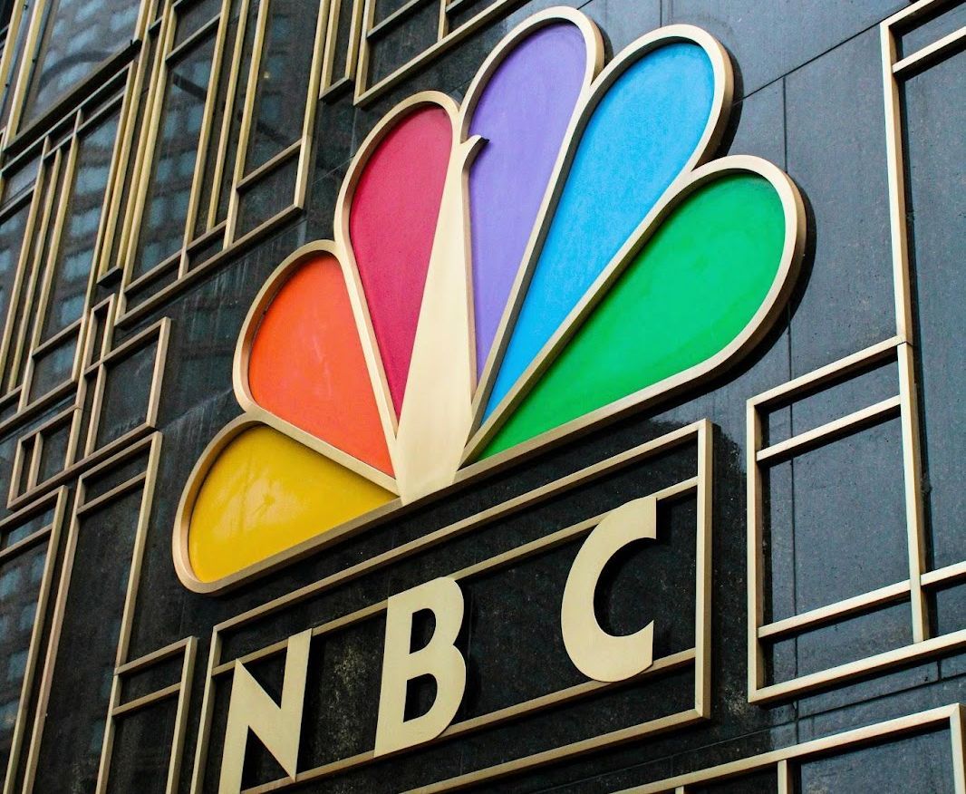
The National Broadcasting Company (NBC) didn’t need an eye-catching logo back when it was just a radio network. There was a time when the black serif letters "NBC" were enough to represent it. It all changed, however, in the 1950s when TV programming in color emerged, and RCA, which owned NBC, wanted to promote the purchasing of color TV sets.
To symbolize the new era of TV, NBC transformed its logo into one featuring a peacock surrounded by vibrant, multicolored feathers. The original version showcased a rainbow of 11 hues. Years later, the drawing was simplified and the feathers were reduced to 6 so that each would represent a different division of the network: news, sports, entertainment, stations, network, and productions.
Guinness
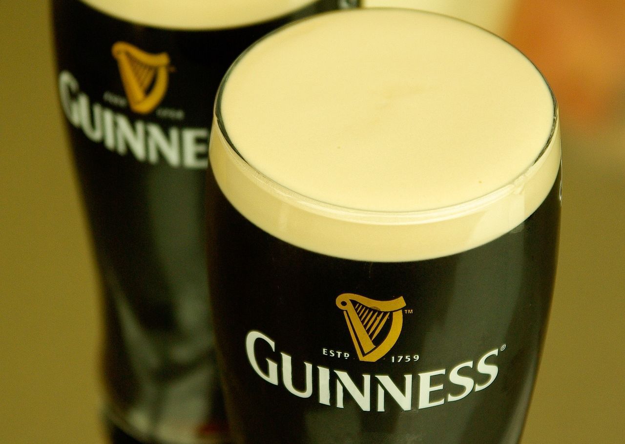
Guinness beer has been produced in Irish territory since 1759. Back in 1862, the company chose the heraldic symbol of Ireland to label their ales. The design is that of a specific harp, called the "Brian Boru harp," which is on display at Trinity College Dublin today.
Guinness as a symbol is so ingrained in Irish culture that by the time the country was independent and the Free State Government of 1922 had to officialize the State emblem, the particular image of the Irish harp was already taken. If you pay attention, you’ll see that the harp in Irish coinage has its straight edge facing right, and Guinness’s has its edge facing left. This was the solution they arrived at.
Apple
Have you ever seen the very first Apple logo? It was created in 1976 by co-founder Ronald Wayne. It was a sketch illustration in full detail of Sir Isaac Newton sitting under an apple tree, in front of a radiant landscape, surrounded by a flowing ribbon with the words "Apple Computer Co."
Beautiful as it was, the image was hardly representative of an innovative technology-developing company. A year later, designer Rob Janoff reduced the whole concept to the now iconically simple outline of the bitten apple that we all know. The detail of the bite was just added for scale so that people wouldn’t mistake the fruit for a cherry.
Adidas

Very few brands have a logo so famous that it gets its own name. But that’s the case for Adidas’ "Three Stripes." The trademarked symbol of three parallel lines already traced the sporting footwear designed by Adolf Dassler’s brand in 1949. Although this was initially an aesthetic decision to make the shoes stand out, eventually the three bars were incorporated into the logos.
Over the years, Adidas has created different logos to represent its different branches, like its Originals or Performance products. Whether it be the staggered lines symbolizing the challenge of climbing a mountain or the trefoil version representing the brand’s diversity of apparel, every image of Adidas is crossed by the three iconic lines.