Hidden marketing

Common words that started as brand names, can you guess them all?


Published on December 9, 2025


Image: Diggity Marketing

Ever asked for a Band-Aid when you really meant any bandage? Or told someone to Google something even if they used another search site? We all do it, and we don’t even notice, and that’s because some everyday words we use are actually trademarks that belong to specific companies. Here, we’ve just gathered just a few, but you may end up realizing you sound like a walking commercial more often than you thought.

1

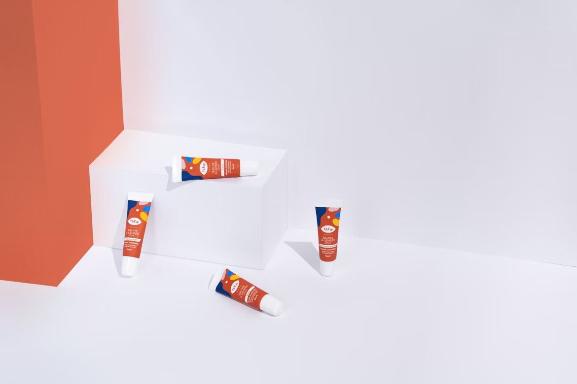
ChapStick or just lip balm?

Image: Trew

Cold weather hits, your lips get dry, and you ask for a ChapStick. But unless it says ChapStick on the tube, you are probably just using a regular lip balm. Wyeth LLC owns the trademark, and they made it official in 2009. By then, the name was already rolling off everyone’s tongue, so it stuck for good.

2

The famous Band-Aid

Image: Possessed Photography

Every cut, scrape, and blister seems to call for a Band-Aid, even when the box actually says something else. Johnson & Johnson trademarked the name in 1925, and it became the word we all use without thinking. Kids, especially, never say "adhesive bandage." It is always a Band-Aid.

3

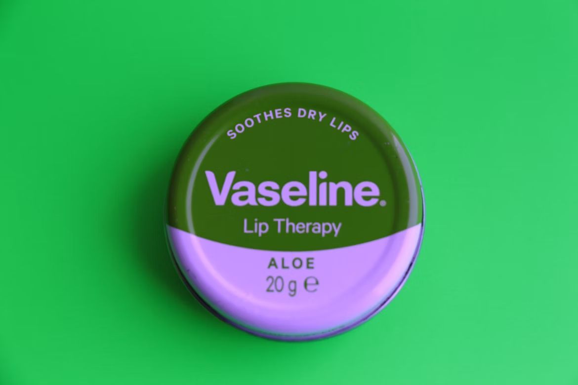
Vaseline in the medicine cabinet

Image: The Drink Break

That little blue-and-white jar might not really be Vaseline, but who is checking the fine print? Unilever owns the name, and technically, it just refers to one brand of petroleum jelly. Yes, that’s the generic term. Still, most of us reach for the name Vaseline whether we are soothing dry skin or covering a scrape.

4

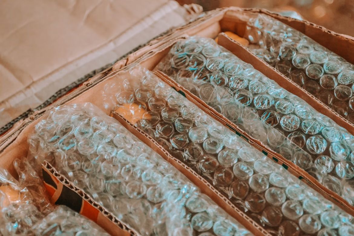
Bubble Wrap and the joy of popping

Image: Wander Fleur

Moving boxes are stressful, but Bubble Wrap makes up for it. Sealed Air Corporation owns the name, trademarked in 1983, but we call just about any sheet of cushioning bubbles Bubble Wrap. And let’s be honest, we care less about the trademark and more about the fun of popping it.

5

Crock-Pot and Sunday dinners

Image: Jacob McGowin

"Throw it in the Crock-Pot" has become kitchen shorthand for slow cooking. Sunbeam registered the name in 1972, and it quickly became part of family dinner traditions. The generic term is slow cooker, but to most of us, Crock-Pot is the only name that matters.

6

Ping-Pong versus table tennis

Image: Jure Zakotnik

Table tennis might be the proper term, but Ping-Pong is the one most of us grew up saying. The trademark dates back to 1931 and belongs to Escalade Sports in America. Still, when friends set up a folding table in the basement, nobody calls it table tennis. Ping-Pong just feels right.

7

Popsicle on a hot day

Image: Jarritos Mexican Soda

Hot summer afternoon, kids run to the freezer, and what do they want? A Popsicle. Unilever owns the trademark, registered in 2001, but really, they are ice pops. Try calling them that and see how many eye rolls you get. Popsicle is the word that stuck.

8

Velcro and the rip sound

Image: SJ 📸

That rip of Velcro is instantly recognizable. The company Velcro Industries trademarked the name in 1975, but technically, it is called a hook-and-loop fastener. Try saying that three times fast. That’s why Velcro won the word war, simply because it is fun to say and easy to remember.

9

Google it

Image: Go to Firmbee.com's profile Firmbee.com

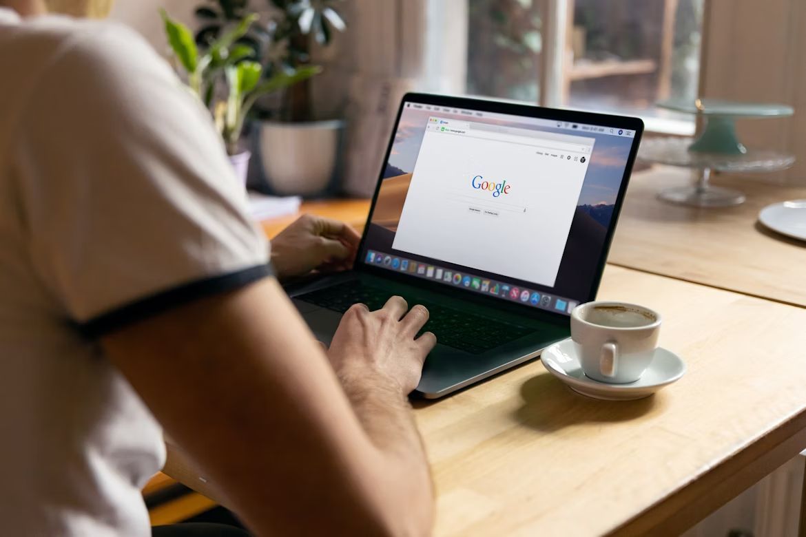
When was the last time you told someone to "Bing it"? Exactly. Google became such a dominant name that it turned into a verb almost overnight. They registered the trademark in 2004, but by now "Google it" means "look it up," no matter which search engine you use.

10

Realtor with a capital R

Image: Tierra Mallorca

Not every real estate agent is a Realtor. That word was trademarked in 1950 by the National Association of Realtors, and it refers only to members of the group. Still, most people toss it around for any agent who shows them a house. It is another case where the trademarked name became the everyday word.

Colors and what they represent

The meaning of colors: What shades say about clothes, décor, and mood


Published on December 9, 2025


Colors aren’t just decoration: they’re tiny storytellers. They set the mood at dinner, change how we feel about our clothes, and can even trick us into thinking a room is bigger (or smaller) than it really is. Here’s a fun tour through ten of the most common colors and what they say in our daily lives. Warning: once you read this, you might never look at your closet—or your living room—the same way again.

1

1. Red: The Life of the Party

Image: Filip Mishevski

Red is the show-off of the color wheel. It’s bold, fiery, and impossible to ignore. Slip on a red dress or tie, and suddenly you’re the main character in the room. Restaurants often use red in their logos because it makes us hungry—think ketchup labels, pizza signs, and soda cans. Coincidence? Definitely not.

In home décor, red can be a little tricky. A red wall screams, "Look at me!" A splash of red, though—like a lamp, pillow, or rug—can give a room instant warmth and energy.

2

2. Blue: The Chill Factor

Image: Merani Cosme

Blue is that friend who always calms things down. Think of the ocean or a clear summer sky—just looking at blue makes us breathe a little easier. Studies show it can even lower blood pressure and slow the heart rate.

In fashion, a blue suit or dress shirt has "trustworthy" written all over it. It’s a classic for job interviews and first dates, because it makes people feel safe around you.

3

3. Yellow: The Human Highlighter

Image: Larisa Brita

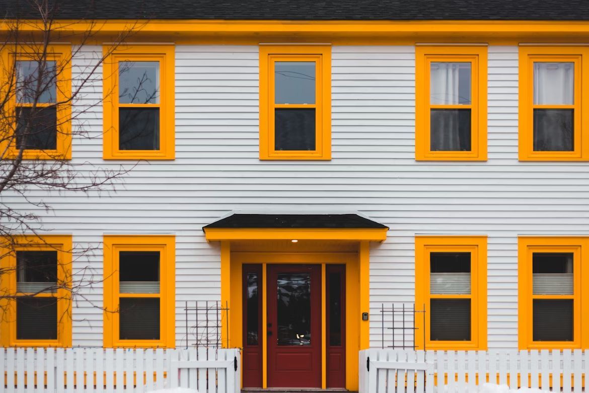
Yellow is sunshine in a crayon box. It’s the color of smiley faces, lemonade stands, and those sticky notes that keep your whole desk organized. Wear yellow, and people immediately think "cheerful."

When decorating, yellow brightens up any space. A pale yellow kitchen feels warm and inviting, like grandma’s house on Sunday morning. Too much, though, and it can be overstimulating—babies have even been shown to cry more in bright yellow rooms.

4

4. Green: Nature’s Neutral

Image: Junior REIS

Green is the color of life itself. It’s the grass under our feet, the leaves above our heads, and the money in our wallets (if we’re lucky). Green clothes often give off a grounded, approachable vibe—perfect for that "I’m relaxed but stylish" look.

In home décor, green works like a neutral while still feeling lively. Olive green couches are surprisingly forgiving of snack spills, and sage walls look fresh without being overwhelming.

5

5. Purple: The Drama Queen

Image: Peter Fitzpatrick

Purple has been associated with royalty for centuries, and it still has that mysterious, slightly dramatic air. A purple scarf or tie says, "I’m bold, but I also read poetry."

At home, purple can be tricky but rewarding. Deep purple curtains bring elegance and luxury, while lighter lavender shades are soothing and romantic. A purple accent wall? That’s the kind of choice that makes your neighbors whisper, "Wow, they must be creative."

6

6. Orange: The Attention Grabber

Image: Erik Mclean

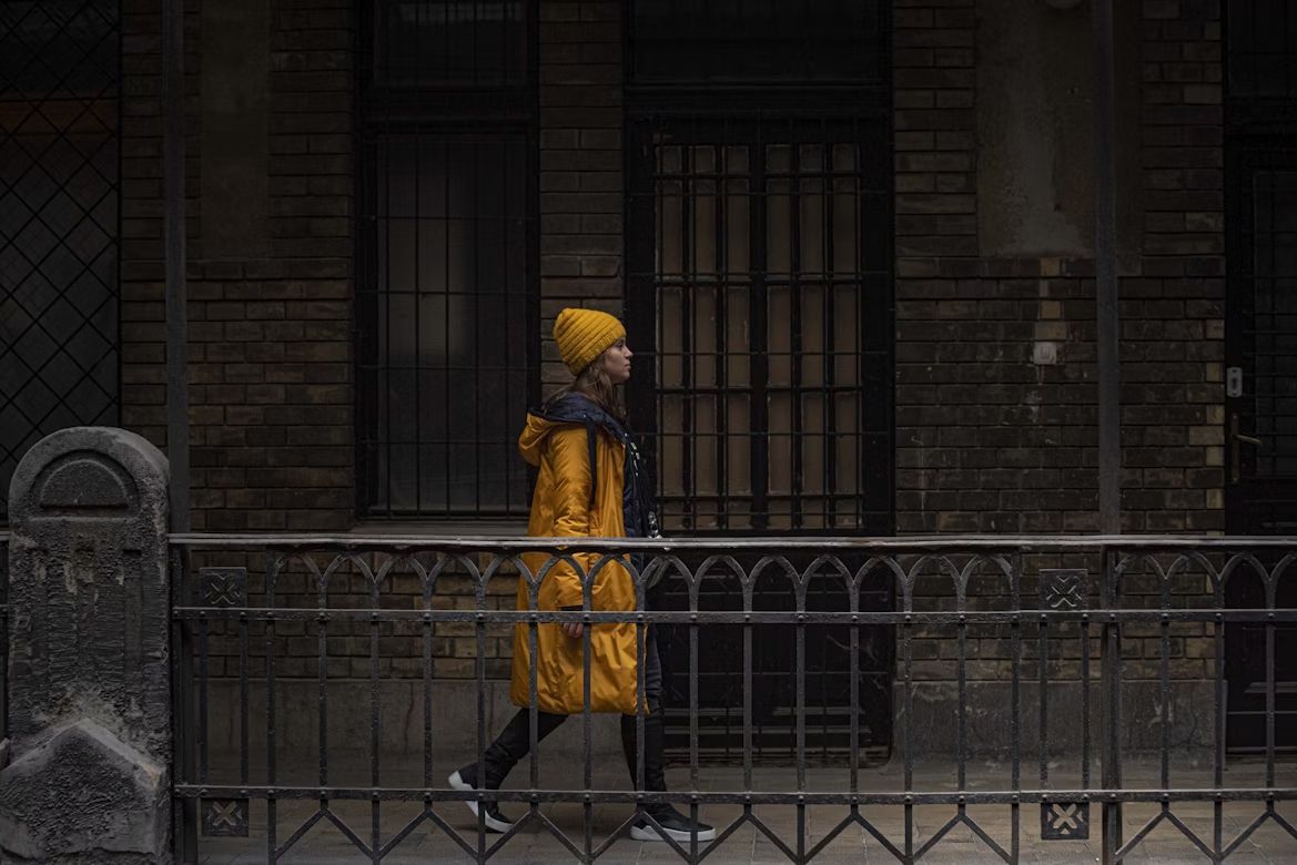
Orange is like red’s more approachable cousin. It’s energetic but playful, the color of pumpkins, sunsets, and every construction cone you’ve ever tried to avoid. Wear orange, and you’ll never blend into the background—it’s the ultimate "notice me" shade.

In décor, orange works best in doses. A burnt orange sofa pillow can make a beige couch look exciting instead of boring. Pair orange with neutrals, and it feels warm and cozy, like a fall afternoon.

7

7. Black: The Timeless Classic

Image: Andrey Zvyagintsev

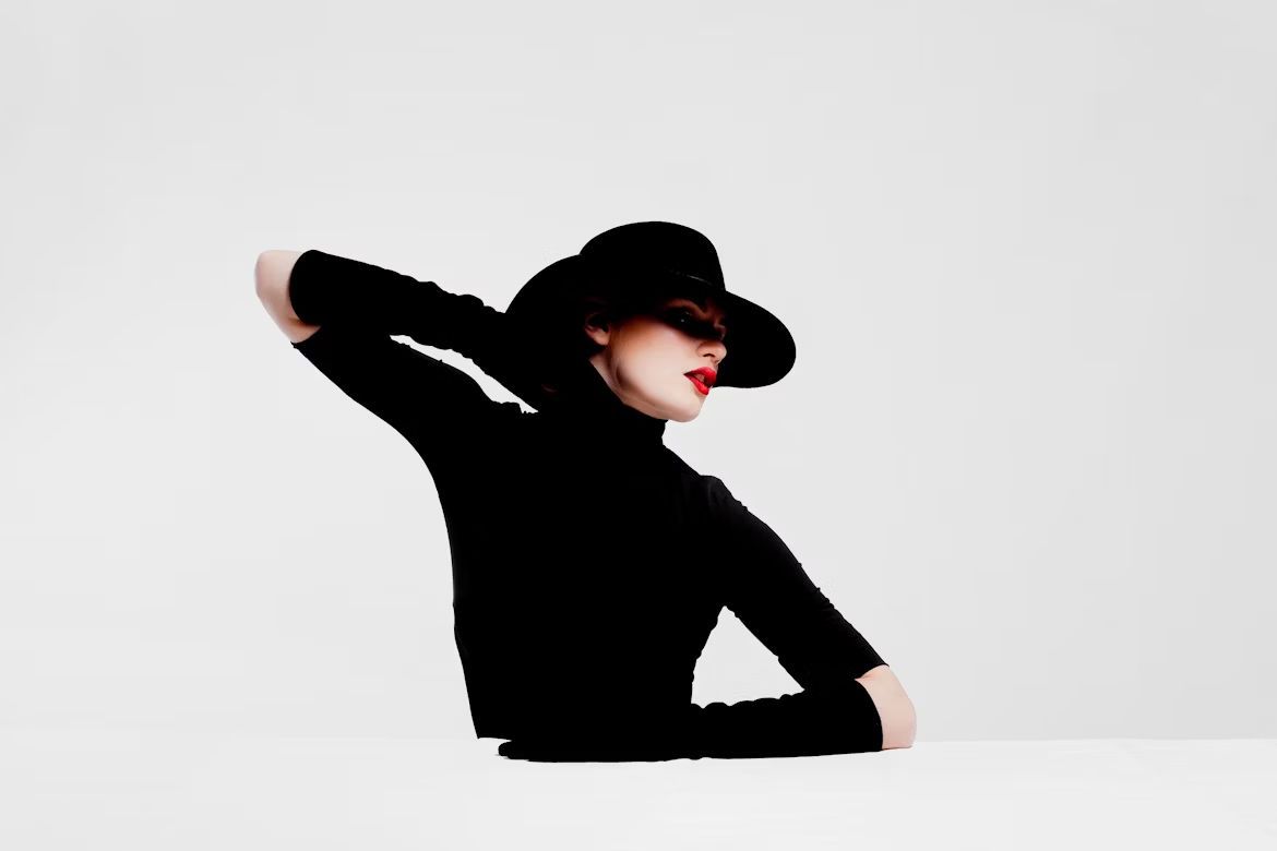
Black never goes out of style. In fashion, it’s the ultimate slimming trick, but it’s also chic and elegant.

At home, black adds drama and contrast. A black lamp or table grounds a space, making lighter colors pop. Too much, however, can feel a little cave-like—unless you’re going for that "Batman’s lair" vibe.

8

8. White: The Blank Canvas

Image: Hans

White is all about freshness and simplicity. Wear a crisp white shirt, and you look instantly polished—even if you got dressed in three minutes flat. The downside? White attracts stains like magnets attract fridge doors.

In decoration, white walls are like a blank canvas. They make rooms look bigger and brighter, but they can also feel a little… sterile. Add texture—like a fluffy white rug or a cozy throw blanket—and suddenly white feels welcoming instead of hospital chic.

9

9. Pink: The Playful Rebel

Image: Doyo Hermann

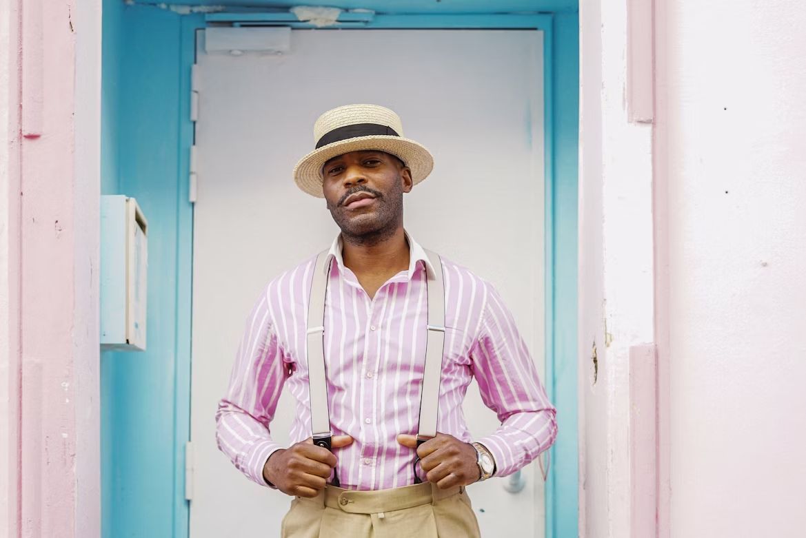
Pink has traveled a long way from being "just for girls." These days, a pink shirt or dress can look bold, stylish, and surprisingly powerful. Wear pink, and you’re basically saying, "I don’t take myself too seriously—but I look good doing it."

In décor, pink can soften a room without making it feel childish. A dusty rose couch feels trendy and chic, while blush pink walls give off a warm, welcoming glow. Add gold accents, and suddenly pink is less "cotton candy" and more "cocktail lounge."

10

10. Brown: The Unsung Hero

Image: Mary Skrynnikova

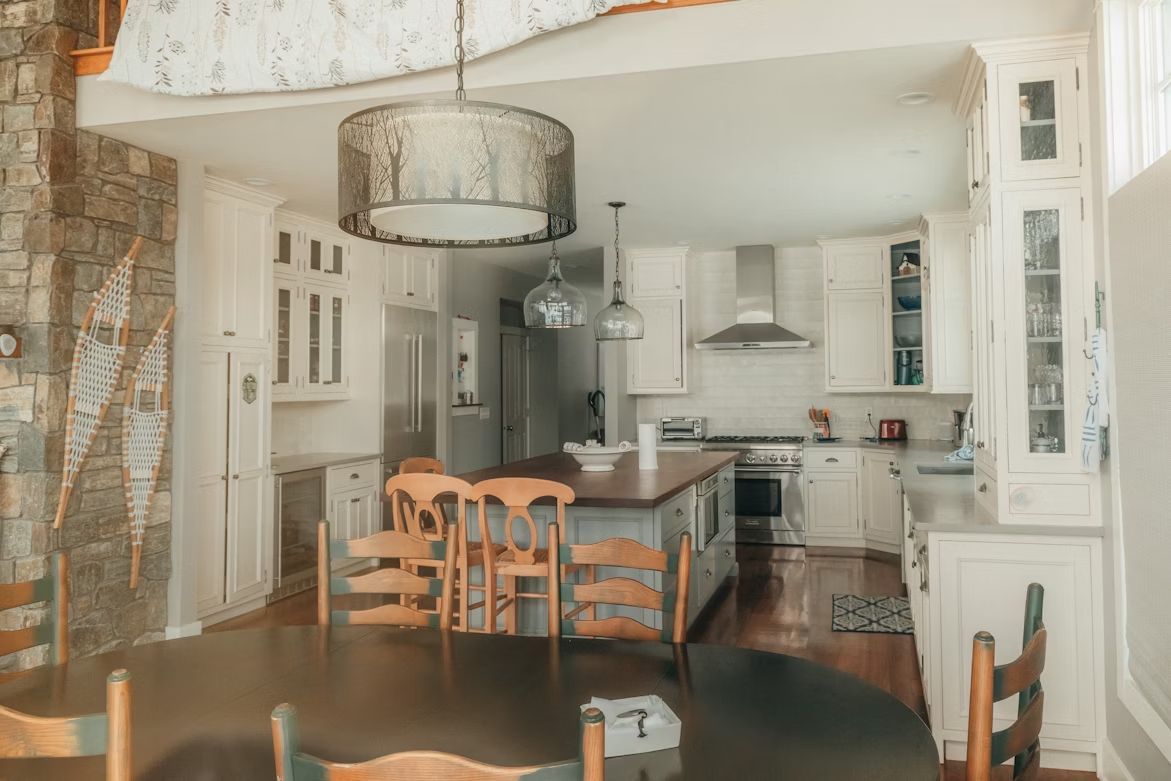
Brown doesn’t usually grab the spotlight, but it’s everywhere—coffee, chocolate, leather jackets, and comfy boots. Wear brown, and you instantly look approachable, dependable, and maybe just a little outdoorsy.

In homes, brown works like a cozy blanket. Wooden furniture, tan couches, or even a rustic rug instantly make a room feel grounded and warm. It’s the color equivalent of comfort food: steady, reliable, and always satisfying.

Looking for an extra scoop of literary fun?

Learn more with our Word of the day

dispel

/dəˈspɛl/