Decoding language

10 punctuation secrets your teachers never told you


Published on March 30, 2026

Image: Samuel Ramos

Punctuation shapes how we read, write, and think—yet it often goes unnoticed until its absence makes a sentence hard to understand. Most punctuation marks weren’t always part of the language; many have surprising backstories, and some are even relatively recent additions to English grammar. Here are the stories behind 10 marks that give structure—and meaning—to our sentences.

1

Period

Image: Randy Tarampi

The period began as a simple dot used by Aristophanes of Byzantium to mark the end of a sentence. Its purpose was to improve clarity in long manuscripts, at a time when spaces between words did not exist.

Over the centuries, it evolved into the familiar punctuation mark we know today, becoming a universal symbol of grammatical correctness.

2

Comma

Image: Jacob Pretorius

The comma was added in the 3rd century BCE to indicate a brief pause while reading aloud. Its name comes from the Greek komma, meaning "a piece cut off."

It was later popularized in the Renaissance to structure complex sentences, helping writers convey rhythm and meaning more clearly.

3

Semicolon

Image: Annie Spratt

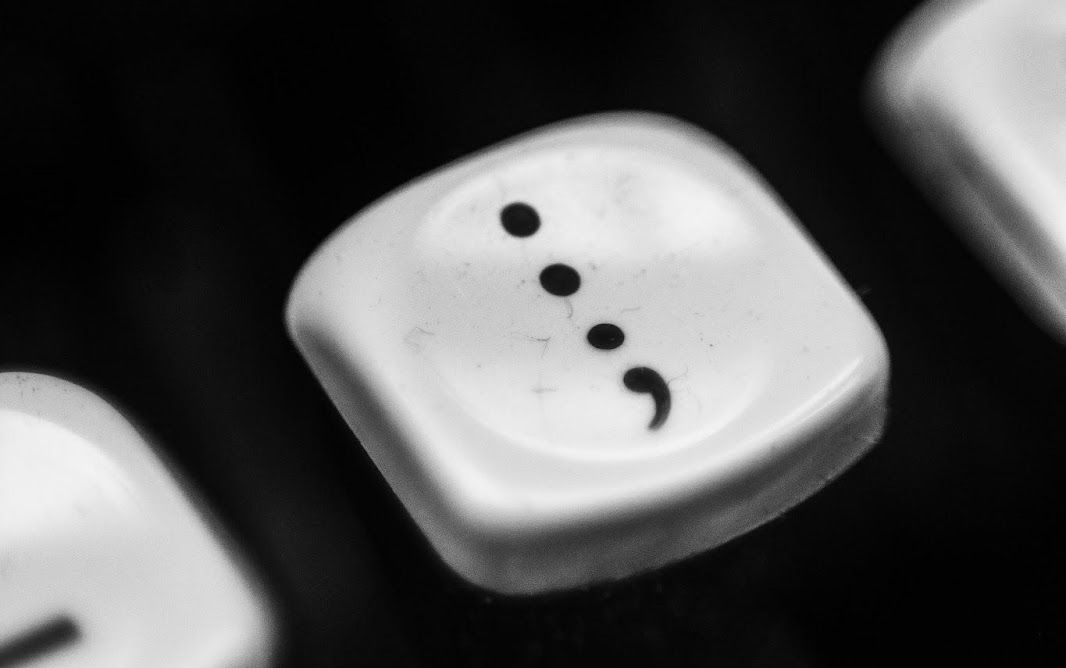
Italian printer Aldus Manutius introduced the semicolon in 1494 to separate closely related independent clauses.

It became a favorite among scholars, as it allowed nuanced connections between ideas without fully breaking a sentence.

4

Colon

Image: Connor Pope

The colon was also popularized by Manutius, used to introduce lists or explanations.

It historically guided readers in written speeches or complex texts, marking a shift in thought or attention to important details.

5

Question Mark

Image: Uladzislau Petrushkevich

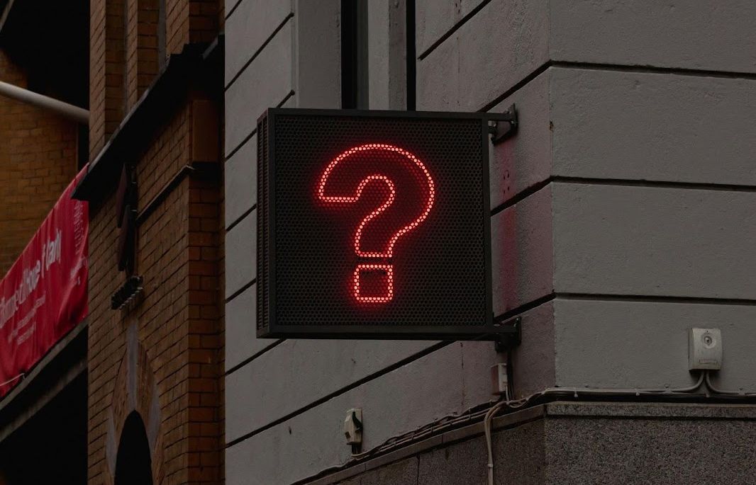
The question mark likely comes from the Latin word quaestio, which was often abbreviated as ‘qo’ at the end of sentences.

Scribes eventually stylized the abbreviation into the curved mark we use today, which has become a universal signal for a question or inquiry.

6

Apostrophe

Image: James Orr

Introduced in the 16th century, the apostrophe marks omitted letters and abbreviations, as in don’t from do not.

It also indicates possession in English; however, its use in that sense didn’t become standardized until the 18th century.

7

Hyphen

Image: Tim Mossholder

The hyphen emerged in the Middle Ages to join words or split lines. Printers sometimes used it to avoid awkward spacing.

Today, it joins compounds like well-being or divides words at line breaks, helping preserve clarity in written language.

8

Parentheses

Image: Brett Jordan

Parentheses were introduced in the 15th century to provide supplemental information without breaking the main text.

They guide readers through secondary thoughts, examples, or clarifications more efficiently.

9

Ampersand

Image: John Murphey

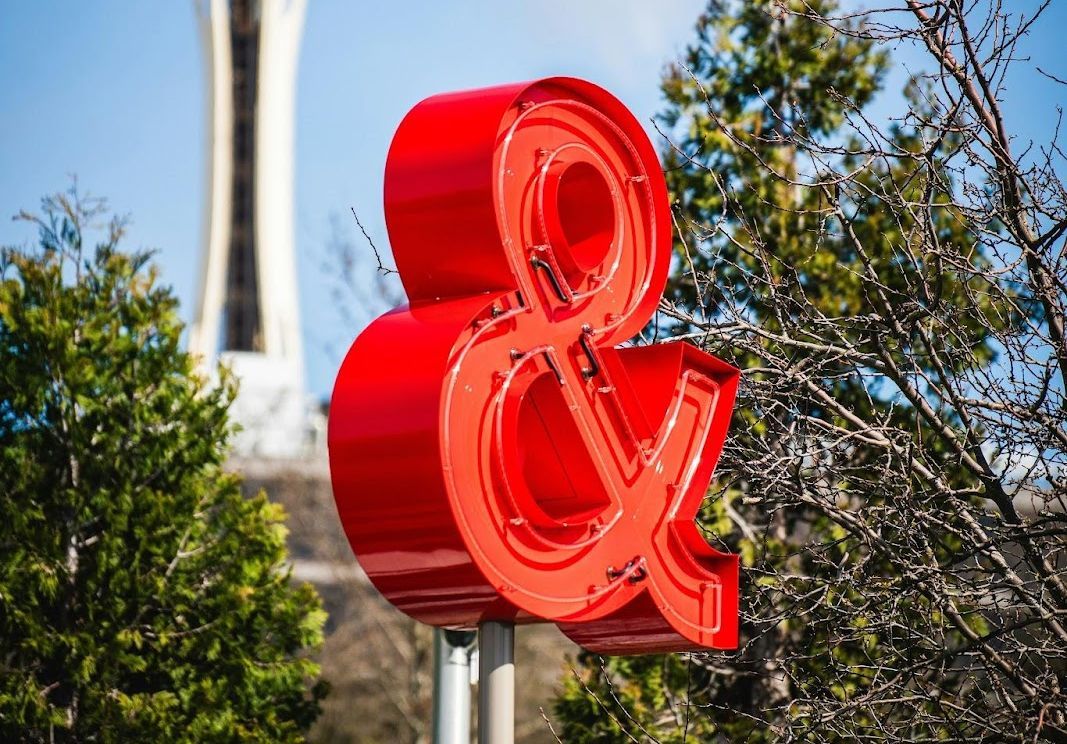
Did you know that the ampersand is a ligature of the letters "e" and "t"? Together, they form et, the Latin word for "and."

Used since Roman times, it became a typographical shorthand as well as a symbol of elegance in logos and design.

10

Interrobang

Image: Laura España

Created in 1962 by Martin K. Speckter, the interrobang combines a question mark and an exclamation mark into a single symbol.

It expresses surprise and inquiry simultaneously, though it never became a standard punctuation mark. However, using both signs together is common in comic books and informal writing to convey the same effect.



Secret uses

There’s a hidden microphone in your phone, and here’s where it is


Published on March 30, 2026


Image: Inside Creative House

You’ve probably twisted a bread bag closed, filled up your car, or pulled a sheet of aluminum foil from the box thousands of times without giving it a second thought. But many of the everyday objects we’ve used for decades have clever features that most people never notice. From the tiny pocket on blue jeans to the little arrow next to your gas gauge, these hidden designs have practical stories behind them, and once you know them, you’ll never look at these familiar items the same way again.

1

​Dot next to the iPhone camera

Image: DenPhotos

If you own an iPhone, you’ve probably noticed the tiny black dot next to the rear camera. It’s small, so people tend to assume it’s another camera sensor or even part of the phone’s design. The small hole found near the camera bump on every iPhone is actually a rear microphone.

It captures clearer audio when you’re recording videos and helps reduce background noise during FaceTime and regular phone calls. If you own an iPhone Pro model from the iPhone 12 Pro onward, you'll also see a larger dark circle. That’s the LiDAR scanner, which sends out invisible infrared light to create a 3D map of your surroundings. It helps the camera focus faster in low light, powers Apple’s Measure app, and makes augmented reality features much more accurate.

2

​Indent on the bottom of wine bottles

Image: tartaphotography

Whether it's a holiday dinner, an anniversary, or simply a nice meal with friends, you’ve probably held a wine bottle and noticed the deep indentation in the bottom. Many people tend to think the deeper the indent, the fancier the bottle.

That indentation is called a punt, and it’s been a part of the bottle-making for centuries. Originally, it helped strengthen hand-blown glass bottles, making them less likely to crack under pressure. Today, it still adds structural stability, particularly for sparkling wines, while also giving servers a comfortable place to rest their thumb when pouring, though some say it helps collect the sediment as wines age. In any case, a deeper pun doesn’t automatically mean a better or more expensive bottle.

3

​Dashboard gas gauge arrow

Image: happycreator

Almost every driver has experienced that awkward moment at the gas station. You pull up to the pump, step out of the car, and suddenly realize the fuel door is on the opposite side.

To help prevent exactly that situation, many modern vehicles include a small arrow next to the gas pump symbol on the dashboard’s fuel gauge. The arrow points towards the side of the vehicle where the fuel filler door is located. It’s a small detail on the dashboard, yet once you notice it, you’ll never have to circle the pump again.

4

​Tiny hole outside an elevator door

Image: chanonnat srisura

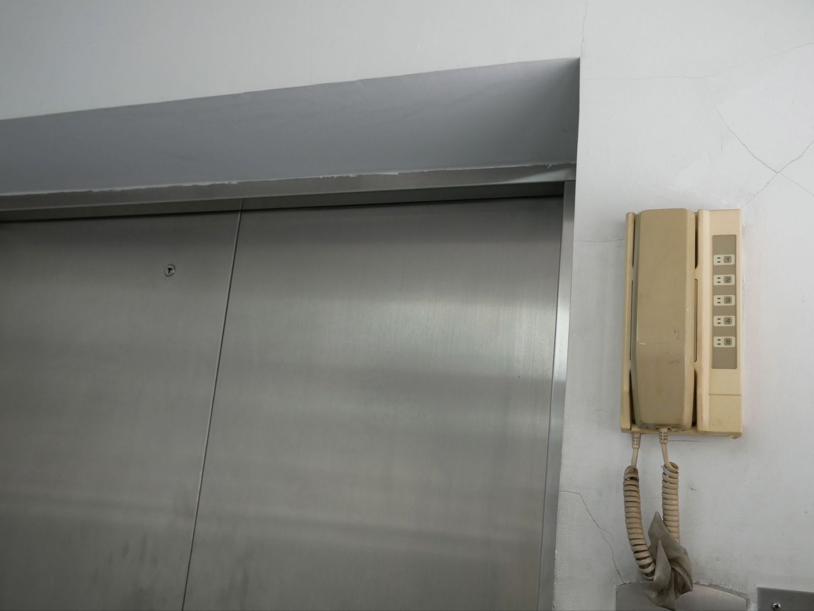
All elevators look pretty much the same. Bigger or smaller, they all look similar, a gray box with a mirror and buttons. But if you pay close attention, you may notice there’s a small round opening near the top of the door.

That opening is a keyhole used by trained maintenance technicians and emergency responders. With a special elevator key, they can manually unlock the landing doors when repairs are needed or if passengers become trapped inside. The system allows professionals to reach the elevator safely without damaging the doors or relying solely on electrical controls. Hopefully, most of us will never need to see it in action. But in an emergency, that tiny opening becomes one of the most important parts of the system.

5

Colored tags on store-bought bread

Image: Towfiqu ahamed barbhuiya

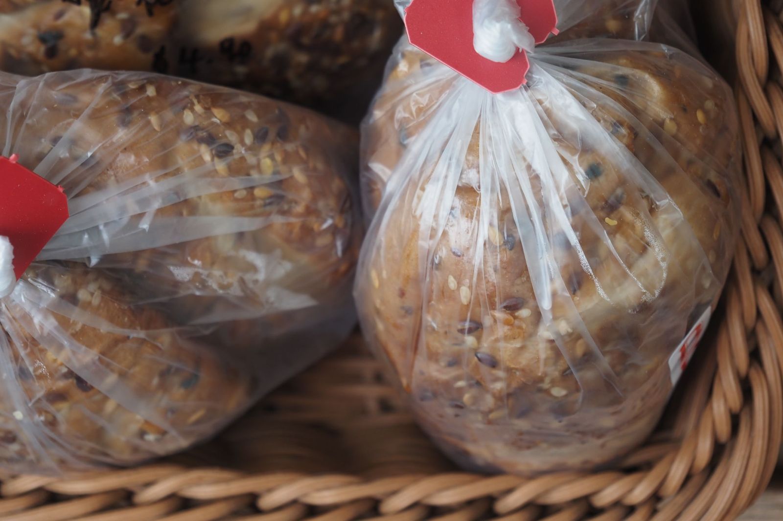
If you’ve ever stood in the bread aisle comparing loaves, you’ve probably noticed the colorful plastic clips or twist ties holding the bags shut. Contrary to what many think, they’re not simply a part of the packaging.

For many bakeries and grocery stores, the colors indicate the day a loaf was delivered or baked. While the exact color schedule can vary between bakeries and regions, employees use the system to quickly spot older inventory and rotate fresher bread to the back of the shelf. That way, customers are more likely to pick up the freshest loaf available.

6

​Tiny pocket on blue jean

Image: triocean

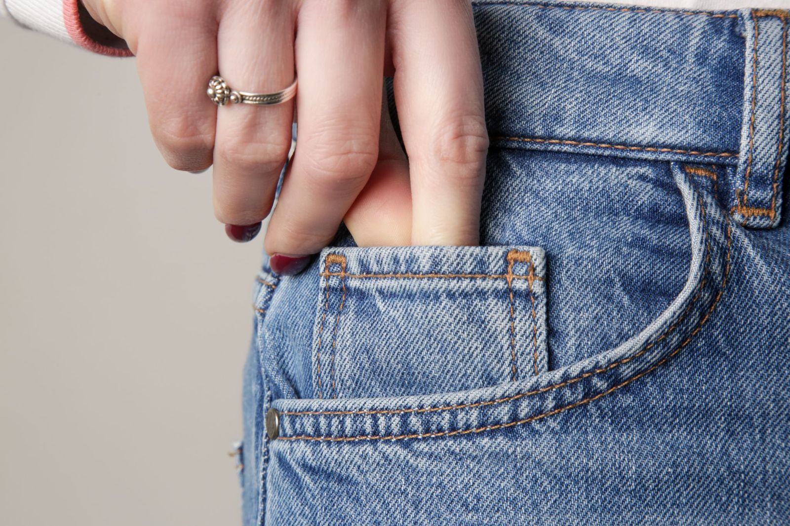
Whether you wear jeans every day or only pull them out for yard work, you’ve probably noticed the tiny extra pocket tucked inside one of the front pockets. It’s too small for a phone and not very useful for loose change, but there’s a reason for it.

Back in the 1800s, when Levi Strauss & Co. created rugged denim pants for miners, ranchers, and cowboys working across the American West, pocket watches were commonplace. Workers needed a safe place to carry their watches while riding horses, so that little pocket was designed specifically to protect the watch from damage. Pocket watches disappeared, but the tiny pocket became such an iconic part of blue jeans that manufacturers have continued including it for well over a century.

7

​Perforations on aluminum wrap boxes

Image: The Image Party

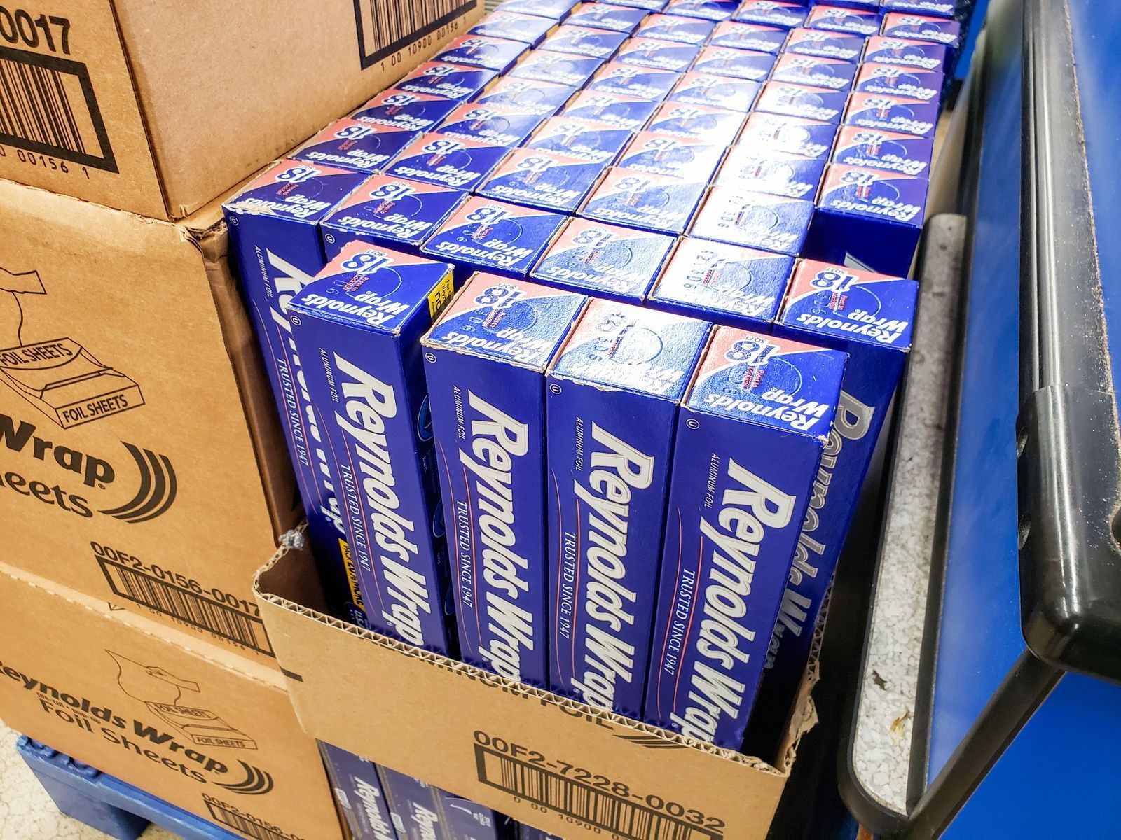
Almost everyone has had the same frustrating experience. You pull on a sheet of aluminum foil, and suddenly the entire roll slides out of the box and lands on the kitchen counter.

That’s exactly why major manufacturers such as Reynolds introduced the small side tabs, known as end locks, in the mid-1990s. By pressing the tabs inward, they hold the cardboard roll in place like built-in axles. This keeps the roll from sliding out of the box, makes it much more stable as you pull, and helps the serrated edge cut a cleaner, straighter sheet. It also reduces waste by preventing the foil from bunching up or tearing unevenly. It’s a simple design, yet useful as it can get.

8

​Hole in pen caps

Image: Konektus Photo

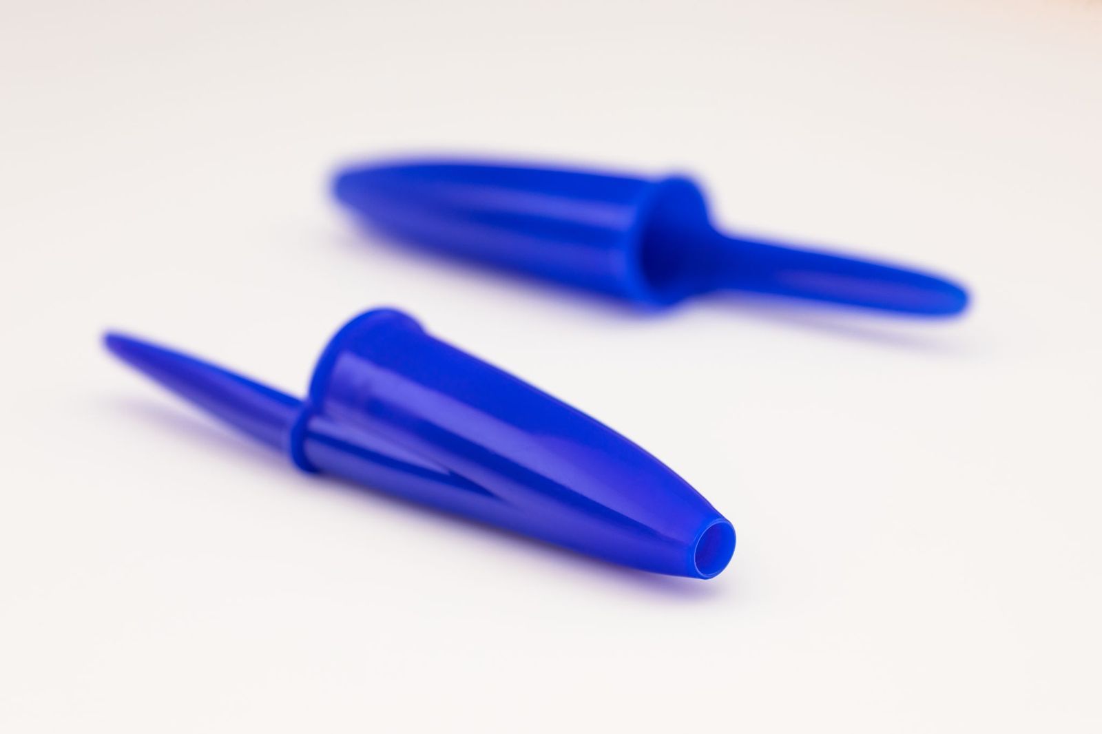
Every household has pens lying around for all kinds of purposes. And most of them have a common feature, a hole in the cap, which isn’t simply part of the design.

BIC and other pen manufacturers included the opening as a safety feature. If someone, especially a child, accidentally swallows a pen cap, the hole can allow a small amount of air to pass through, reducing the risk of complete airway blockage while emergency help is on the way. The design became part of border efforts to improve consumer product safety after choking incidents drew attention to the danger of small plastic objects.

9

​A strawberry attached to a pincushion

Image: Kimberly Hall

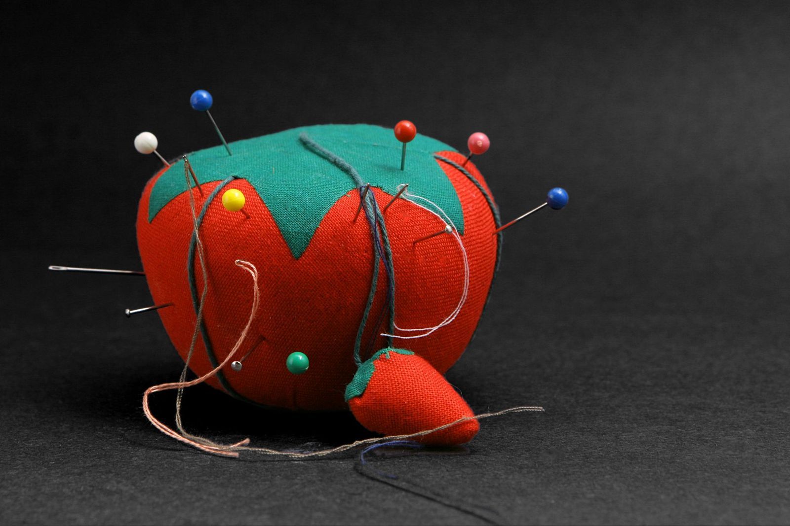
If you grew up sewing or watching somebody do it, you probably remember the classic tomato-shaped pincushion sitting beside the sewing basket. Hanging from it was a tiny red strawberry that looked like nothing more than a cute finishing touch.

In reality, that little strawberry has its own job. Instead of soft stuffing, it’s filled with emery, a gritty material made from crushed abrasive minerals. Running pins and needles through it helps polish away tiny spots of rust, smooth rough edges, and keep the points sharp enough to glide through fabric more easily.

10

​Ridges on the F and J keyboard keys

Image: alexkich

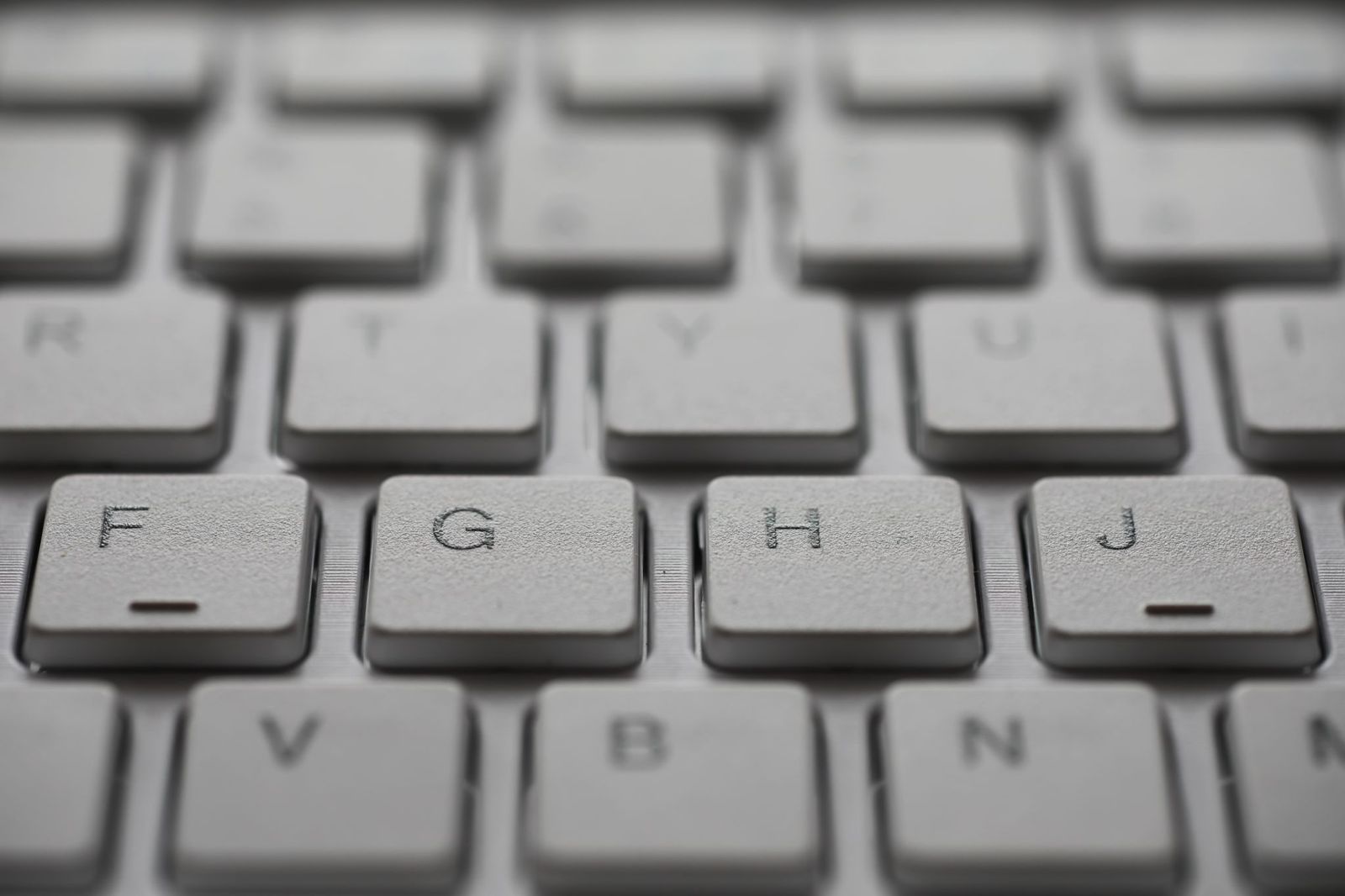
Think back to the first time you learned to type. Maybe it was at work, or on a family computer. Wherever it was, someone probably told you to keep your fingers on the "home row." That’s exactly why the F and J keys have tiny raised ridges.

The bumps let your index fingers find the correct starting position by touch alone, allowing you to type without constantly looking down at the keyboard. The technique, known as "touch typing," is widely credited to American court stenographer Frank Edward McGurrin, who demonstrated it in 1888. As typewriters became more common, manufacturers experimented with different ways to help typists orient their hands, and by the mid-20th century, companies such as IBM standardized the subtly raised plastic bars that remain on nearly every keyboard today.

Looking for an extra scoop of literary fun?

Learn more with our Word of the day

literal

/ˈlɪdərəl/