What is a Twix, anyway?

Is the Snickers bar named after an animal? 12 candy names explained


Published on January 12, 2026
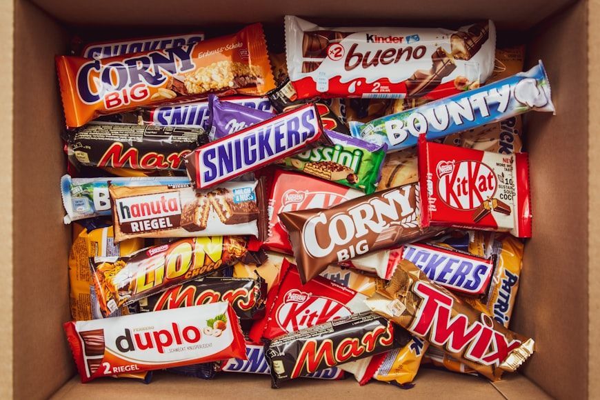

Image: Denny Müller

If you have never seen a Reese’s Peanut Butter Cup or an Almond Joy but only read the name, chances are that you would be able to form an idea of the product. But this is not always the case with candies and candy bars. Many of these delicious treats have names that do not seem to have any logical connection with their contents. But they do have it. Take a look at the following 12 famous examples. Did you know about any of these?

1

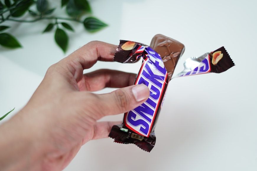
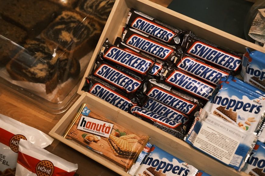
Snickers

Image: Shyam Mishra

The Snickers bar, introduced by the Mars, Inc. company in 1930, was named after the Mars family's favorite horse. Snickers lived on their farm and was dearly loved.

Sadly, the horse passed away shortly before the candy bar's release, so naming the bar after him served as a tribute to their cherished companion.

2

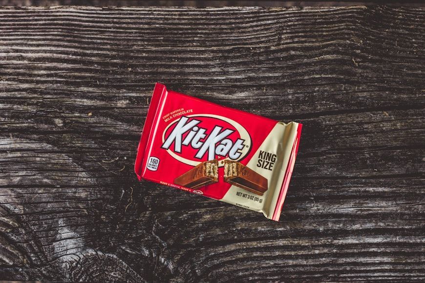
Kit Kat

Image: Justin

The name Kit Kat traces back to the 18th-century Kit-Cat Club in London, which itself was named after Christopher Catling, a pastry chef nicknamed "Kit Cat."

Rowntree's, the company that launched the bar in the 1930s, chose the name to give it a touch of history and sophistication.

3

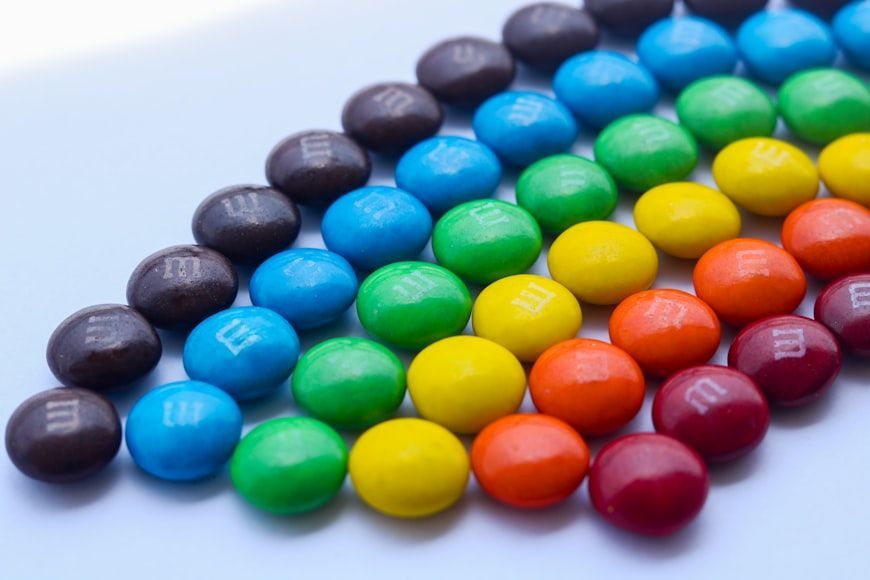
M&M’s

Image: Irfan Zaini

M&M’s stands for Mars and Murrie, the last names of the candy’s creators. Forrest Mars of the Mars Company teamed up with Bruce Murrie, son of Hershey’s president, and the delicious, colorful candies were born.

4

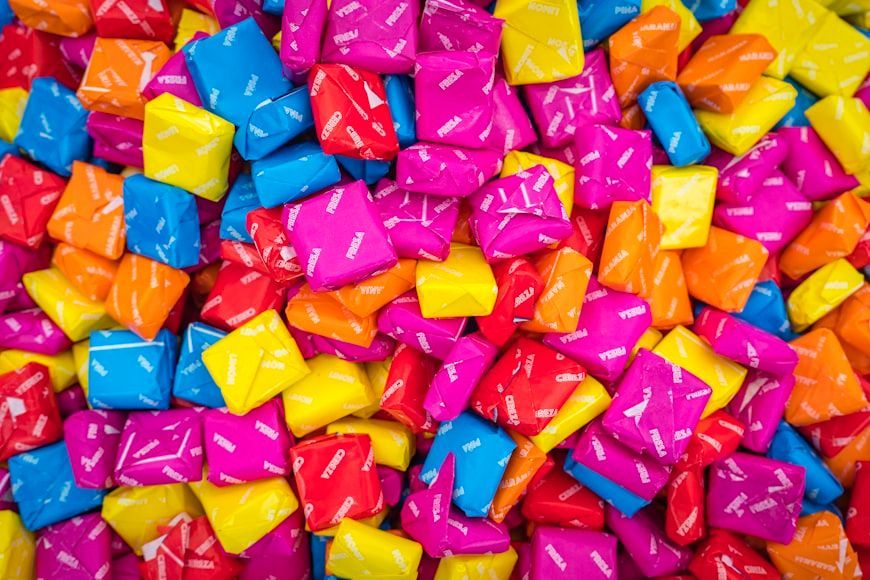
Starburst

Image: Alexander Schimmeck

Starburst got its name to reflect the candy’s bold, fruity flavors, like a burst of flavor in every bite.

Originally launched in the UK in 1960 as Opal Fruits, it was renamed Starburst for the U.S. release in 1967, likely to create a more dynamic, space-age image during the height of the space race.

5

Sour Patch Kids

Image: Steffen Rehfuß

Sour Patch Kids were originally called Mars Men when they debuted in the 1970s, playing off the era’s fascination with space.

When introduced in the U.S. in 1985, the name changed to Sour Patch Kids to tap into the Cabbage Patch Kids craze. The new name also highlights the candy’s signature sour-then-sweet taste.

6

3 Musketeers

Image: Cemrecan Yurtman

The 3 Musketeers bar got its name in 1932 from its original trio of flavors: chocolate, strawberry, and vanilla. Each bar came in three separate pieces, echoing the "three" theme.

The name also nodded to the popular novel The Three Musketeers. During World War II, rising costs of sugar and fruit led to the discontinuation of strawberry and vanilla, leaving only chocolate—the version we still enjoy today.

7

Milky Way

Image: Alan Pope

The Milky Way bar was named after a popular malted milk drink from the 1920s, not the galaxy.

The name was meant to suggest a creamy, rich flavor, echoing the appeal of the drink that inspired it.

8

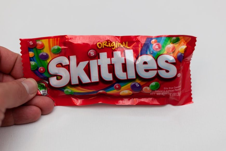
Skittles

Image: Jonathan J. Castellon

Skittles were named after the old European game of skittles, similar to bowling. The candy's round shape was the connection with the original game.

First produced in the UK in 1974 by a British distributor for Mars, Inc., the name was likely chosen to convey fun and flavor variety.

9

PayDay

Image: Erik Mclean

The PayDay bar got its name because it was first made on—yes, you guessed it—a payday at the Hollywood Candy Company. The timing inspired the name, which stuck.

Introduced in 1932 during the Great Depression, it was marketed as an affordable, energy-packed snack. With its combination of peanuts and caramel, it offered real substance, which can be a metaphor for a little "payday" in candy form.

10

Baby Ruth

Image: Louis Hansel

Anyone would be forgiven for thinking that the Baby Ruth bar was named after baseball legend Babe Ruth—but that’s not the case. The candy does indeed sound like it could honor the sports icon, but the Curtiss Candy Company claimed otherwise.

They stated that it was named after Ruth Cleveland, the daughter of President Grover Cleveland.

11

100 Grand Bar

Image: NATasha Nguyen

The 100 Grand bar was originally called the $100,000 Bar, inspired by quiz shows with big prizes, such as The $64,000 Question.

In the mid-1980s, Nestlé renamed it 100 Grand, likely to ease trademark issues and generate a greater appeal by simplifying the name.

12

Twix

Image: Petr Magera

The name Twix is a blend of the words "twin" and "sticks," referring to its two chocolate-covered biscuit bars. It was first released in the UK in 1967 under the name Raider.

When introduced in the U.S. in 1979, the bar was renamed Twix. The twin-bar design later inspired the playful "Left vs. Right Twix" advertising campaign.

Secret uses

There’s a hidden microphone in your phone, and here’s where it is


Published on January 12, 2026


Image: Inside Creative House

You’ve probably twisted a bread bag closed, filled up your car, or pulled a sheet of aluminum foil from the box thousands of times without giving it a second thought. But many of the everyday objects we’ve used for decades have clever features that most people never notice. From the tiny pocket on blue jeans to the little arrow next to your gas gauge, these hidden designs have practical stories behind them, and once you know them, you’ll never look at these familiar items the same way again.

1

​Dot next to the iPhone camera

Image: DenPhotos

If you own an iPhone, you’ve probably noticed the tiny black dot next to the rear camera. It’s small, so people tend to assume it’s another camera sensor or even part of the phone’s design. The small hole found near the camera bump on every iPhone is actually a rear microphone.

It captures clearer audio when you’re recording videos and helps reduce background noise during FaceTime and regular phone calls. If you own an iPhone Pro model from the iPhone 12 Pro onward, you'll also see a larger dark circle. That’s the LiDAR scanner, which sends out invisible infrared light to create a 3D map of your surroundings. It helps the camera focus faster in low light, powers Apple’s Measure app, and makes augmented reality features much more accurate.

2

​Indent on the bottom of wine bottles

Image: tartaphotography

Whether it's a holiday dinner, an anniversary, or simply a nice meal with friends, you’ve probably held a wine bottle and noticed the deep indentation in the bottom. Many people tend to think the deeper the indent, the fancier the bottle.

That indentation is called a punt, and it’s been a part of the bottle-making for centuries. Originally, it helped strengthen hand-blown glass bottles, making them less likely to crack under pressure. Today, it still adds structural stability, particularly for sparkling wines, while also giving servers a comfortable place to rest their thumb when pouring, though some say it helps collect the sediment as wines age. In any case, a deeper pun doesn’t automatically mean a better or more expensive bottle.

3

​Dashboard gas gauge arrow

Image: happycreator

Almost every driver has experienced that awkward moment at the gas station. You pull up to the pump, step out of the car, and suddenly realize the fuel door is on the opposite side.

To help prevent exactly that situation, many modern vehicles include a small arrow next to the gas pump symbol on the dashboard’s fuel gauge. The arrow points towards the side of the vehicle where the fuel filler door is located. It’s a small detail on the dashboard, yet once you notice it, you’ll never have to circle the pump again.

4

​Tiny hole outside an elevator door

Image: chanonnat srisura

All elevators look pretty much the same. Bigger or smaller, they all look similar, a gray box with a mirror and buttons. But if you pay close attention, you may notice there’s a small round opening near the top of the door.

That opening is a keyhole used by trained maintenance technicians and emergency responders. With a special elevator key, they can manually unlock the landing doors when repairs are needed or if passengers become trapped inside. The system allows professionals to reach the elevator safely without damaging the doors or relying solely on electrical controls. Hopefully, most of us will never need to see it in action. But in an emergency, that tiny opening becomes one of the most important parts of the system.

5

Colored tags on store-bought bread

Image: Towfiqu ahamed barbhuiya

If you’ve ever stood in the bread aisle comparing loaves, you’ve probably noticed the colorful plastic clips or twist ties holding the bags shut. Contrary to what many think, they’re not simply a part of the packaging.

For many bakeries and grocery stores, the colors indicate the day a loaf was delivered or baked. While the exact color schedule can vary between bakeries and regions, employees use the system to quickly spot older inventory and rotate fresher bread to the back of the shelf. That way, customers are more likely to pick up the freshest loaf available.

6

​Tiny pocket on blue jean

Image: triocean

Whether you wear jeans every day or only pull them out for yard work, you’ve probably noticed the tiny extra pocket tucked inside one of the front pockets. It’s too small for a phone and not very useful for loose change, but there’s a reason for it.

Back in the 1800s, when Levi Strauss & Co. created rugged denim pants for miners, ranchers, and cowboys working across the American West, pocket watches were commonplace. Workers needed a safe place to carry their watches while riding horses, so that little pocket was designed specifically to protect the watch from damage. Pocket watches disappeared, but the tiny pocket became such an iconic part of blue jeans that manufacturers have continued including it for well over a century.

7

​Perforations on aluminum wrap boxes

Image: The Image Party

Almost everyone has had the same frustrating experience. You pull on a sheet of aluminum foil, and suddenly the entire roll slides out of the box and lands on the kitchen counter.

That’s exactly why major manufacturers such as Reynolds introduced the small side tabs, known as end locks, in the mid-1990s. By pressing the tabs inward, they hold the cardboard roll in place like built-in axles. This keeps the roll from sliding out of the box, makes it much more stable as you pull, and helps the serrated edge cut a cleaner, straighter sheet. It also reduces waste by preventing the foil from bunching up or tearing unevenly. It’s a simple design, yet useful as it can get.

8

​Hole in pen caps

Image: Konektus Photo

Every household has pens lying around for all kinds of purposes. And most of them have a common feature, a hole in the cap, which isn’t simply part of the design.

BIC and other pen manufacturers included the opening as a safety feature. If someone, especially a child, accidentally swallows a pen cap, the hole can allow a small amount of air to pass through, reducing the risk of complete airway blockage while emergency help is on the way. The design became part of border efforts to improve consumer product safety after choking incidents drew attention to the danger of small plastic objects.

9

​A strawberry attached to a pincushion

Image: Kimberly Hall

If you grew up sewing or watching somebody do it, you probably remember the classic tomato-shaped pincushion sitting beside the sewing basket. Hanging from it was a tiny red strawberry that looked like nothing more than a cute finishing touch.

In reality, that little strawberry has its own job. Instead of soft stuffing, it’s filled with emery, a gritty material made from crushed abrasive minerals. Running pins and needles through it helps polish away tiny spots of rust, smooth rough edges, and keep the points sharp enough to glide through fabric more easily.

10

​Ridges on the F and J keyboard keys

Image: alexkich

Think back to the first time you learned to type. Maybe it was at work, or on a family computer. Wherever it was, someone probably told you to keep your fingers on the "home row." That’s exactly why the F and J keys have tiny raised ridges.

The bumps let your index fingers find the correct starting position by touch alone, allowing you to type without constantly looking down at the keyboard. The technique, known as "touch typing," is widely credited to American court stenographer Frank Edward McGurrin, who demonstrated it in 1888. As typewriters became more common, manufacturers experimented with different ways to help typists orient their hands, and by the mid-20th century, companies such as IBM standardized the subtly raised plastic bars that remain on nearly every keyboard today.

Looking for an extra scoop of literary fun?

Learn more with our Word of the day

haughtiness

/ˈhɔdinəs/