Big names ahead

Why is the Apple logo bitten? Learn the truth about 12 iconic logos


Published on May 4, 2025


Image: Yucel Moran

A good logo has to communicate what the brand it represents is all about. It should do so in the simplest and most elegant way possible, conveying the brand’s spirit and core concept. The following 12 famous brands have managed to create iconic logos that not only represent them successfully but also include a subtle, partially hidden message. Did you know about any of these?

1

Carrefour

Image: James Orr

The name of the French supermarket chain means "intersection" in its native language. This meaning is clearly reflected in its logo, with its two arrows pointing in opposite directions. Additionally, hidden in the space between the arrows you can see the shape of the letter "C."

2

Amazon

Image: BoliviaInteligente

Amazon’s logo has a ubiquitous online presence. It’s simple, and it has been streamlined over the years. If you’ve ever wondered what the arrow beneath the logo means, take a look at its starting and ending points: it goes from A to Z.

3

Cisco

Image: Zozz_

The name Cisco comes from the common abbreviation of San Francisco, its hometown. The logo portrays the two towers of the Golden Gate Bridge, arranged in a shape that also suggests a sound wave.

4

Apple

Image: Bangyu Wang

Why does Apple’s logo have a bite mark on it? The reason is practical: if there was no bite mark, the smaller versions of the logo—used on a variety of gadgets including the iPhone—might look like a cherry.

5

FedEx

Image: jp26jp

The FedEx logo looks quite normal, but it hides a small detail, overlooked by most: between the second "E" and the "x," the negative space forms a small arrow pointing forward, symbolizing speed and precision.

6

Toblerone

Image: Safwan C K

The triangular Swiss chocolate Toblerone uses the Matterhorn—one of Switzerland’s most iconic mountains—as its logo. But, if you look closely, inside the mountain you can spot the shape of a bear, which is the official symbol of the Swiss town of Bern, the original home of Toblerone.

7

Levi’s

Image: Eduardo Pastor

If you’ve ever wondered what the red logo of the Levi’s brand means, then you should take a look at the stitching on the back pocket of any pair of their jeans—the shape matches perfectly.

8

Wendy’s

Image: Jacob McGowin

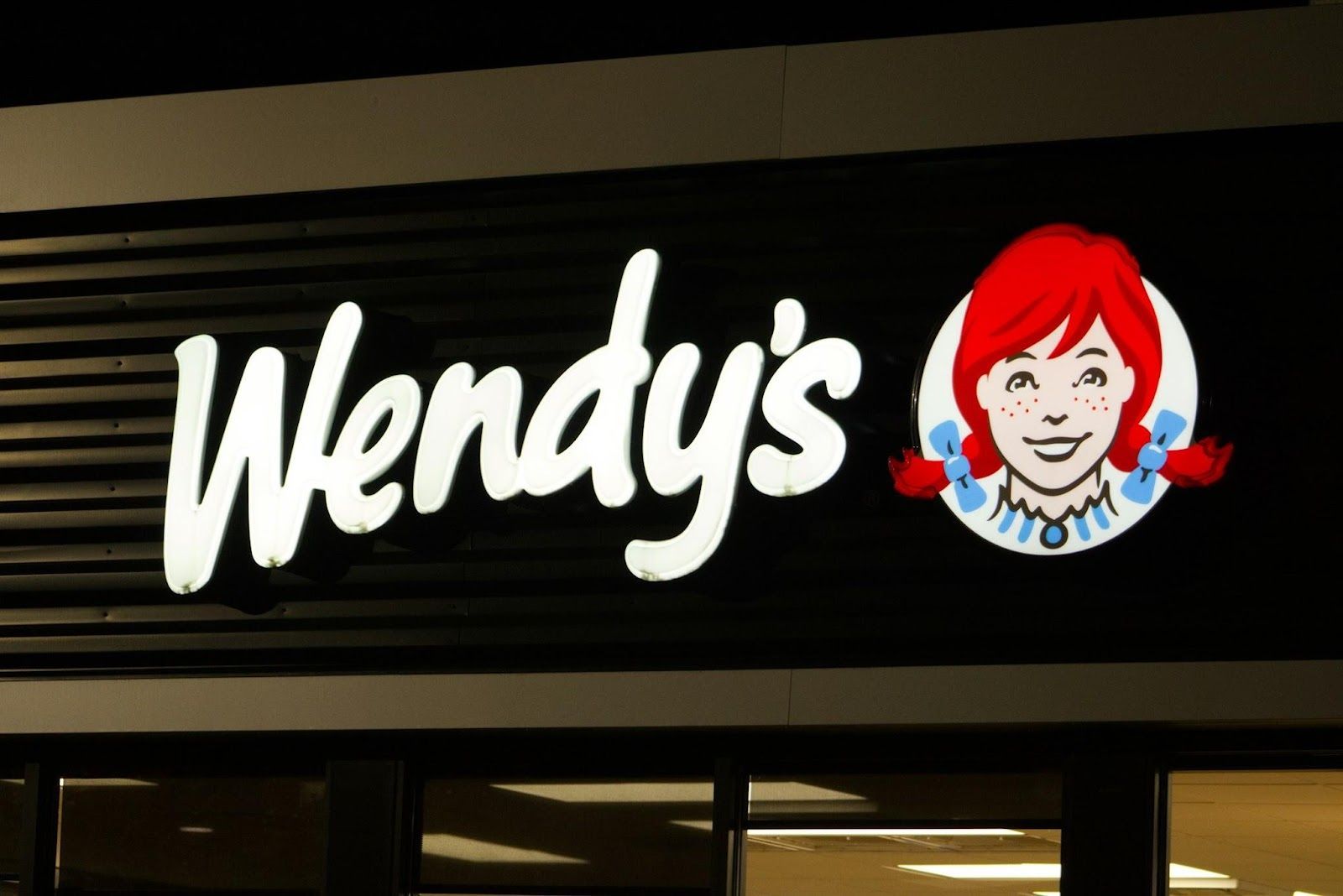
If you take a closer look at the neckline of the redheaded girl in the Wendy’s logo, you’ll notice that her shirt collar subtly spells out the word "mom." This detail is meant to evoke the feeling of home-cooked meals, just like something made by your mom.

9

NBC

Image: appshunter.io

The NBC logo is formed by the colors of the rainbow, which represent the colors of modern television. But at the center, you can see the shape of a peacock, with its beak pointing to the right. The colorful shapes around it represent the bird’s spread feathers.

10

BMW

Image: Pablo Martinez

While some people suggest that the two-colored BMB circle represents a propeller, based on the airplane manufacturing history of the brand, the truth points elsewhere. The blue and white segments actually represent the flag of Bavaria, the region where the company originated.

11

Baskin-Robbins

Image: Crystal Jo

The world’s largest chain of ice cream shops, Baskin-Robbins, is best known for offering 31 flavors of ice cream. Its logo cleverly features the number "31" highlighted in pink, hidden within the center of the design.

12

Tesla

Image: Alexander Shatov

The stylized logo and lettermark of the electric car brand Tesla is designed to resemble the cross-section of an electric motor. Or, at least, a meaningful part of it.

Stop! You’ve been using these 11 objects the wrong way


Published on May 4, 2025


Image: Diana Polekhina

We use countless objects daily without questioning their design, yet many have hidden features or were meant for entirely different purposes. From kitchen tools to bananas, here are 11 everyday items you might be using all wrong—or that at least have surprising secrets built in.

1

Toothpaste

Image: Anastasia Nikitina

Yes, toothpaste was always intended to clean and polish teeth, but its mild abrasives make it effective for cleaning jewelry, removing stains from clothing, and even defogging mirrors.

Interestingly, the first toothpaste-like substance dates back to ancient Egypt, where a blend of pumice and vinegar was used for oral care. Modern toothpaste, which includes ingredients like baking soda—another household staple—explains why it’s so effective on surfaces beyond just teeth.

2

Pasta spoons

Image: Markus Winkler

That hole in your pasta spoon isn’t just for draining water; it can also help measure a perfect portion of dry spaghetti!

A single serving of spaghetti is about the amount that fits through the hole. This design prevents cooking too much or too little, though not all pasta spoons have holes large enough for accurate measuring.

3

Gas pumps

Image: engin akyurt

The latch inside gas pump nozzles was originally designed to shut off fuel flow automatically when the tank is full, not to hold the pump open.

Modern pumps use this mechanism as a safety feature, preventing spills and overflows. In some places, using the latch to hold the nozzle open is even illegal due to fire risks.

4

Grocery carts

Image: Karsten Winegeart

Those metal loops on the back of grocery cart seats aren’t just for show—they’re designed to hold plastic bags with fragile items.

Hanging lighter bags here prevents them from being crushed by heavier groceries in the cart, yet few shoppers take advantage of this simple design. So, next time you go shopping, give it a try—it could be a real lifesaver.

5

Soda can tabs

Image: Bam Mccarthy

The hole in a soda can tab isn’t just part of the opening mechanism—it can double as a straw holder. Once you pop the can open, turning the tab around aligns the hole perfectly for a straw. This prevents the straw from floating or shifting while drinking.

While this wasn’t the original intent behind the design, it’s a clever and surprisingly convenient way to make use of an otherwise inconsequential design quirk.

6

Two-tone erasers

Image: Annie Spratt

If you're like me, this has likely been a brain teaser since childhood: What is the blue side of a two-tone eraser for? Popular wisdom says it's for ink removal, but have you ever tried erasing ink with that side? It just completely obliterates the paper.

Well, it turns out the blue side of a two-tone eraser was actually designed for use on heavier paper, not for removing ink.

7

Keyboard bumps

Image: Matúš Kameniar

The small bumps on the ‘F’ and ‘J’ keys exist to help typists find their hand placement without looking.

These tactile guides help your fingers find their way back to the home row, enabling faster and more efficient typing. Even if you're not a professional typist, you can rely on this feature to improve both speed and accuracy while writing.

8

Peeling bananas

Image: Monika Guzikowska

Ever watched a monkey peel a banana? You might be in for a surprise, because it turns out the easiest way to peel a banana is from the bottom, not the stem.

Monkeys naturally pinch the bottom of the banana and pull, avoiding the struggle of breaking the tough stem. This method also reduces the risk of squishing the fruit inside.

9

Measuring tape

Image: Brett Jordan

The small hole at the end of a measuring tape is designed to hook onto nails or screws for one-person measurements. This feature provides a more stable grip when measuring long distances without needing an extra set of hands.

Also, the serrated edge on some tapes doubles as a tool for marking surfaces. So, next time you don't have a buddy around to help, don’t worry—your measuring tape has you covered!

10

Oven drawer

Image: Andrea Davis

Many people use the drawer under their oven for storage, but it was originally designed as a warming drawer.

This compartment keeps cooked food warm while the rest of the meal finishes, though in some modern models, it may simply be intended for extra storage. Checking your oven’s manual might reveal its true purpose.

11

Wine bottle indent

Image: Mockup Free

Ever heard someone say you can judge a good wine by the depth of the indentation at the bottom of the bottle? Well, that’s a myth, though it may suggest a better-designed bottle.

The indent at the bottom of a wine bottle, called a punt, helps distribute pressure and maintain structural integrity. Originally designed to support the bottle against carbonation in sparkling wines, it’s now mostly tradition but still improves durability.

Looking for an extra scoop of literary fun?

Learn more with our Word of the day

otiose

/ˈoʊdiˌoʊz/