Big names ahead

Once you see it, you’ll never unsee it: 12 brand logos’ hidden messages


Published on May 4, 2025


Image: Yucel Moran

A good logo has to communicate what the brand it represents is all about. It should do so in the simplest and most elegant way possible, conveying the brand’s spirit and core concept. The following 12 famous brands have managed to create iconic logos that not only represent them successfully but also include a subtle, partially hidden message. Did you know about any of these?

1

Carrefour

Image: James Orr

The name of the French supermarket chain means "intersection" in its native language. This meaning is clearly reflected in its logo, with its two arrows pointing in opposite directions. Additionally, hidden in the space between the arrows you can see the shape of the letter "C."

2

Amazon

Image: BoliviaInteligente

Amazon’s logo has a ubiquitous online presence. It’s simple, and it has been streamlined over the years. If you’ve ever wondered what the arrow beneath the logo means, take a look at its starting and ending points: it goes from A to Z.

3

Cisco

Image: Zozz_

The name Cisco comes from the common abbreviation of San Francisco, its hometown. The logo portrays the two towers of the Golden Gate Bridge, arranged in a shape that also suggests a sound wave.

4

Apple

Image: Bangyu Wang

Why does Apple’s logo have a bite mark on it? The reason is practical: if there was no bite mark, the smaller versions of the logo—used on a variety of gadgets including the iPhone—might look like a cherry.

5

FedEx

Image: jp26jp

The FedEx logo looks quite normal, but it hides a small detail, overlooked by most: between the second "E" and the "x," the negative space forms a small arrow pointing forward, symbolizing speed and precision.

6

Toblerone

Image: Safwan C K

The triangular Swiss chocolate Toblerone uses the Matterhorn—one of Switzerland’s most iconic mountains—as its logo. But, if you look closely, inside the mountain you can spot the shape of a bear, which is the official symbol of the Swiss town of Bern, the original home of Toblerone.

7

Levi’s

Image: Eduardo Pastor

If you’ve ever wondered what the red logo of the Levi’s brand means, then you should take a look at the stitching on the back pocket of any pair of their jeans—the shape matches perfectly.

8

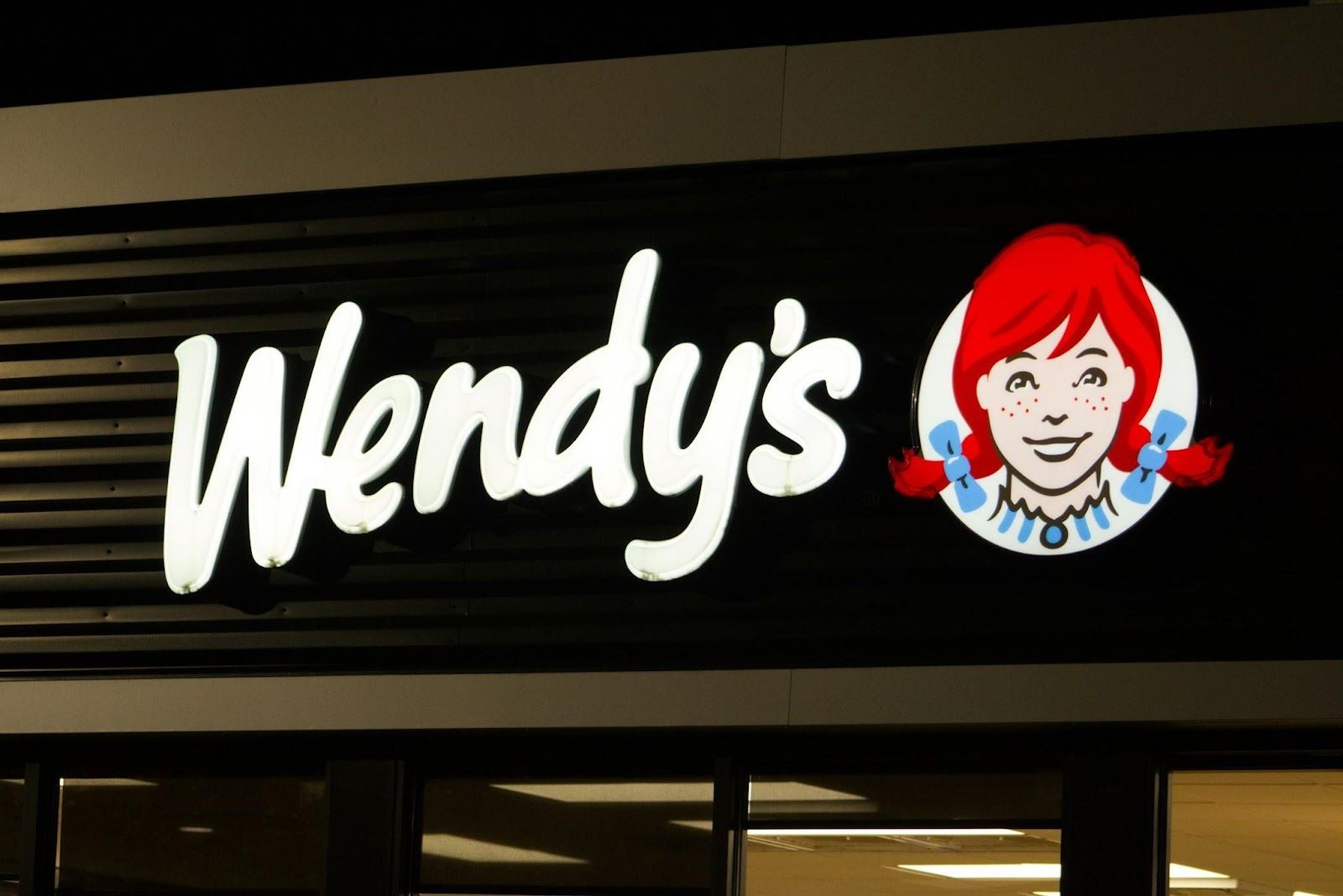
Wendy’s

Image: Jacob McGowin

If you take a closer look at the neckline of the redheaded girl in the Wendy’s logo, you’ll notice that her shirt collar subtly spells out the word "mom." This detail is meant to evoke the feeling of home-cooked meals, just like something made by your mom.

9

NBC

Image: appshunter.io

The NBC logo is formed by the colors of the rainbow, which represent the colors of modern television. But at the center, you can see the shape of a peacock, with its beak pointing to the right. The colorful shapes around it represent the bird’s spread feathers.

10

BMW

Image: Pablo Martinez

While some people suggest that the two-colored BMB circle represents a propeller, based on the airplane manufacturing history of the brand, the truth points elsewhere. The blue and white segments actually represent the flag of Bavaria, the region where the company originated.

11

Baskin-Robbins

Image: Crystal Jo

The world’s largest chain of ice cream shops, Baskin-Robbins, is best known for offering 31 flavors of ice cream. Its logo cleverly features the number "31" highlighted in pink, hidden within the center of the design.

12

Tesla

Image: Alexander Shatov

The stylized logo and lettermark of the electric car brand Tesla is designed to resemble the cross-section of an electric motor. Or, at least, a meaningful part of it.


Fictional spokespeople

What do a clown, a tiger, and a jug have in common? Famous brand mascots


Published on May 4, 2025


Image: 三岁 陈

Who knew a tiger could help sell cereal? Or that adding a smiley face to a juice pitcher would mark the inception of a cultural icon? Some brand mascots started as marketing experiments and evolved into household names, often becoming even more famous than the products they represent. Let’s dive into the origins of these anthropomorphized symbols and explore whether they were rooted in reality or purely imagined.

1

Wendy

Image: Brian J. Tromp

Wendy, the famous red-haired, pigtailed girl, was not entirely fictional: She was named after the founder’s daughter. Dave Thomas opened his new restaurant serving square burgers in 1969 and wanted a family-friendly image that conveyed warmth. To achieve that, he decided to use the name and likeness of his daughter Melinda Lou "Wendy" Thomas.

The original Wendy’s restaurant in Michigan featured pictures of the real girl, but this was not replicated anywhere else. Dave revealed years later that he regretted building the brand around his daughter, which, he felt, exposed her more than intended. Instead, Dave himself appeared in the brand’s commercials until his passing in 2002. After 2010, the real Wendy proudly took over that role.

2

Kool-Aid Man

Image: PublicDomainPictures

Originally, Kool-Aid ads in the 1950s featured a pitcher of Kool-Aid with a simple smiley face. Executives liked the concept, and as the brand evolved, they opted for a more dynamic, engaging character to connect with children—thus, Kool-Aid Man was born.

By the 1970s, Kool-Aid Man had taken on a fully anthropomorphic form: a big, round pitcher with limbs and a face. Known for his dramatic entrances and unforgettable catchphrase, "Oh yeah!," he would burst through walls to save the day and bring refreshment, becoming a hero to thirsty kids. He has since become a true pop culture figure, frequently cited online and in comedy TV shows like Family Guy.

3

Betty Crocker

Image: Taryn Elliott

Even though General Mills's Betty Crocker has never been a real person, she has ranked among America's most trusted figures for decades. In 1945, Fortune magazine named her the second most popular woman in America, right after Eleanor Roosevelt.

She was created by the Washburn-Crosby Company to personalize responses to customer inquiries about baking. This, in turn, helped make the brand appear more human and friendly. "Crocker" was a nod to William Crocker, a retired executive of the company. Over the years, a series of "portraits" were published to depict how she looked, which only fueled the belief of thousands who thought the famous cook was real.

4

Ronald McDonald

Image: Brett Jordan

Characteristic bright yellow-and-red colors and a wide grin: that is the trademark of the clown mascot of McDonald’s fast-food chain. He is probably one of the most recognizable mascots in the world. Ronald has remained McDonald's most iconic mascot since the 1960s, though the brand introduced other characters over the years, such as Grimace, the Hamburglar, and Birdie the Early Bird, all of whom populate the imaginary McDonaldland.

This clown was inspired by the success of a Washington, D.C.-based clown named "Bozo." Willard Scott, the actor behind Bozo, played the first Ronald McDonald, wearing an early version of the iconic costume, complete with a cup for a nose and a tray on his head.

5

Colonel Sanders

Image: Erik Mclean

Colonel Sanders has always been KFC's main mascot, though he’s been portrayed by different actors over the years, including Reba McEntire, George Hamilton, and the ironically named Norm Macdonald. Colonel Harland Sanders was a real person, born in 1890, who began selling his famous fried chicken from a roadside restaurant in Kentucky during the 1930s. Known for his white suit, black string tie, and goatee, Sanders established a look that would define KFC for generations.

After selling his company, he remained the face of KFC, making public appearances as "the Colonel." His image became iconic, and his smiling face is forever lit up in KFC restaurants around the world.

6

Michelin Man

Image: Laura Paredis

The Michelin Man is officially called Bibendum, or "Bib" for short. The name comes from the Latin phrase "Nunc est bibendum," meaning "Now is the time to drink." This was because the first ad featuring him showed an illustration of Bibendum holding a glass filled with nails, broken glass, and other sharp objects, with the slogan, "Michelin tires drink up obstacles."

Bibendum was born in 1894 when the founders of Michelin, noticed a stack of tires that resembled a human figure. Four years later, artist Marius Rossillon brought him to life in the first iconic poster. Back then, Bib was supposed to stand for the toughness and resilience of Michelin tires, but over the years, his look softened, and he took on a friendlier appearance, ditching the accessories he had been adorned with at first, like spectacles and a cigar.

7

Mr. Clean

Image: Anna Shvets

In the late 1950s, Procter & Gamble had an idea: Why not create a genie-like, powerful character to embody the toughness and reliability of cleaning products? Thus, the bald and muscular Mr. Clean was born.

Some say he was loosely modeled after a real-life U.S. Navy sailor, the walking image of strength, trustworthiness, and an impeccable cleaning standard. Whether true or not, Mr. Clean became a household name. Known as "Don Limpio" in Spanish-speaking countries and "Monsieur Propre" in France, his look has remained the same internationally.

8

Captain Morgan

Image: holdosi

The "Captain Morgan pose," with one leg propped up on a barrel, has become iconic and is often replicated by fans. Captain Morgan even launched a "Pose Off" challenge, inviting people to share their best Captain Morgan stance on social media.

Captain Morgan, from the eponymous rum brand, was inspired by Sir Henry Morgan, a real 17th-century Welsh privateer who became famous in the Caribbean for his exploits and later served as Lieutenant Governor of Jamaica. The mascot’s swashbuckling design—complete with a tricorne hat, pirate attire, and the famous pose—invites drinkers to "Live Like the Captain."

9

Juan Valdez

Image: pariwat pannium

Juan Valdez is a coffee brand, but before that, he was a standalone symbol. The coffee farmer was the mascot for the National Federation of Coffee Growers of Colombia. Introduced in the late 1950s, he was meant to personify the hard-working Colombian coffee farmers and distinguish Colombian coffee from other brands in the international market.

The point was to emphasize that all coffee under the Juan Valdez name was 100% Colombian and hand-picked. The character of Juan Valdez, with his traditional coffee farmer attire, mustache, and hat, was designed to reflect the authenticity and heritage of Colombian coffee. He is sometimes accompanied by his mule, Conchita, who helps him transport coffee beans.

10

Tony the Tiger

Image: Dorjan Frrokaj

Let’s wrap up with the one and only behind the famous slogan: "They’re grrreat!" Tony the Tiger is the mascot for Kellogg’s Frosted Flakes cereal, one of the most beloved mascots in advertising. In the 1950s, Kellogg’s also experimented with a few other potential mascots for Frosted Flakes, including Katy the Kangaroo, Elmo the Elephant, and Newt the Gnu, but Tony was the clear fan favorite.

Tony was created in the 1950s by Leo Burnett advertising agency. He was designed to symbolize strength, athleticism, and positivity, encouraging parents to purchase what was marketed as the healthiest cereal for their children. His personality came to life when voice actor Thurl Ravenscroft (also known for singing You’re a Mean One, Mr. Grinch) gave Tony his iconic, deep voice and signature catchphrase.

Looking for an extra scoop of literary fun?

Learn more with our Word of the day

herald

/ˈhɛrəld/