Big names ahead
Once you see it, you’ll never unsee it: 12 brand logos’ hidden messages
Published on May 4, 2025
 Image: Yucel Moran
A good logo has to communicate what the brand it represents is all about. It should do so in the simplest and most elegant way possible, conveying the brand’s spirit and core concept. The following 12 famous brands have managed to create iconic logos that not only represent them successfully but also include a subtle, partially hidden message. Did you know about any of these?
Carrefour
 Image: James Orr
The name of the French supermarket chain means "intersection" in its native language. This meaning is clearly reflected in its logo, with its two arrows pointing in opposite directions. Additionally, hidden in the space between the arrows you can see the shape of the letter "C."
Amazon
 Image: BoliviaInteligente
Amazon’s logo has a ubiquitous online presence. It’s simple, and it has been streamlined over the years. If you’ve ever wondered what the arrow beneath the logo means, take a look at its starting and ending points: it goes from A to Z.
Cisco
 Image: Zozz_
The name Cisco comes from the common abbreviation of San Francisco, its hometown. The logo portrays the two towers of the Golden Gate Bridge, arranged in a shape that also suggests a sound wave.
Apple
 Image: Bangyu Wang
Why does Apple’s logo have a bite mark on it? The reason is practical: if there was no bite mark, the smaller versions of the logo—used on a variety of gadgets including the iPhone—might look like a cherry.
FedEx
 Image: jp26jp
The FedEx logo looks quite normal, but it hides a small detail, overlooked by most: between the second "E" and the "x," the negative space forms a small arrow pointing forward, symbolizing speed and precision.
Toblerone
 Image: Safwan C K
The triangular Swiss chocolate Toblerone uses the Matterhorn—one of Switzerland’s most iconic mountains—as its logo. But, if you look closely, inside the mountain you can spot the shape of a bear, which is the official symbol of the Swiss town of Bern, the original home of Toblerone.
Levi’s
 Image: Eduardo Pastor
If you’ve ever wondered what the red logo of the Levi’s brand means, then you should take a look at the stitching on the back pocket of any pair of their jeans—the shape matches perfectly.
Wendy’s
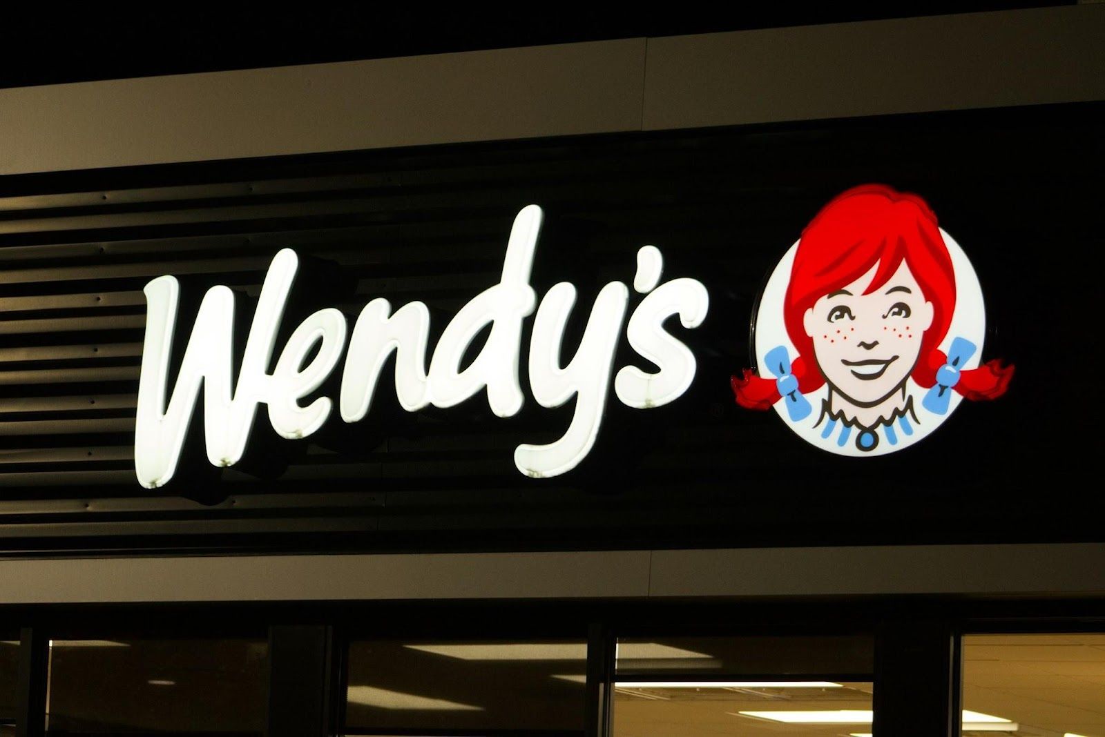 Image: Jacob McGowin
If you take a closer look at the neckline of the redheaded girl in the Wendy’s logo, you’ll notice that her shirt collar subtly spells out the word "mom." This detail is meant to evoke the feeling of home-cooked meals, just like something made by your mom.
NBC
 Image: appshunter.io
The NBC logo is formed by the colors of the rainbow, which represent the colors of modern television. But at the center, you can see the shape of a peacock, with its beak pointing to the right. The colorful shapes around it represent the bird’s spread feathers.
BMW
 Image: Pablo Martinez
While some people suggest that the two-colored BMB circle represents a propeller, based on the airplane manufacturing history of the brand, the truth points elsewhere. The blue and white segments actually represent the flag of Bavaria, the region where the company originated.
Baskin-Robbins
 Image: Crystal Jo
The world’s largest chain of ice cream shops, Baskin-Robbins, is best known for offering 31 flavors of ice cream. Its logo cleverly features the number "31" highlighted in pink, hidden within the center of the design.
Tesla
 Image: Alexander Shatov
The stylized logo and lettermark of the electric car brand Tesla is designed to resemble the cross-section of an electric motor. Or, at least, a meaningful part of it.


